Wall of Love Settings
The wall of love is the widget on your website that shows your approved testimonials. Everything about how it looks is set in Wall of Love in the sidebar — no code changes on your site when you tweak it.
The editor#
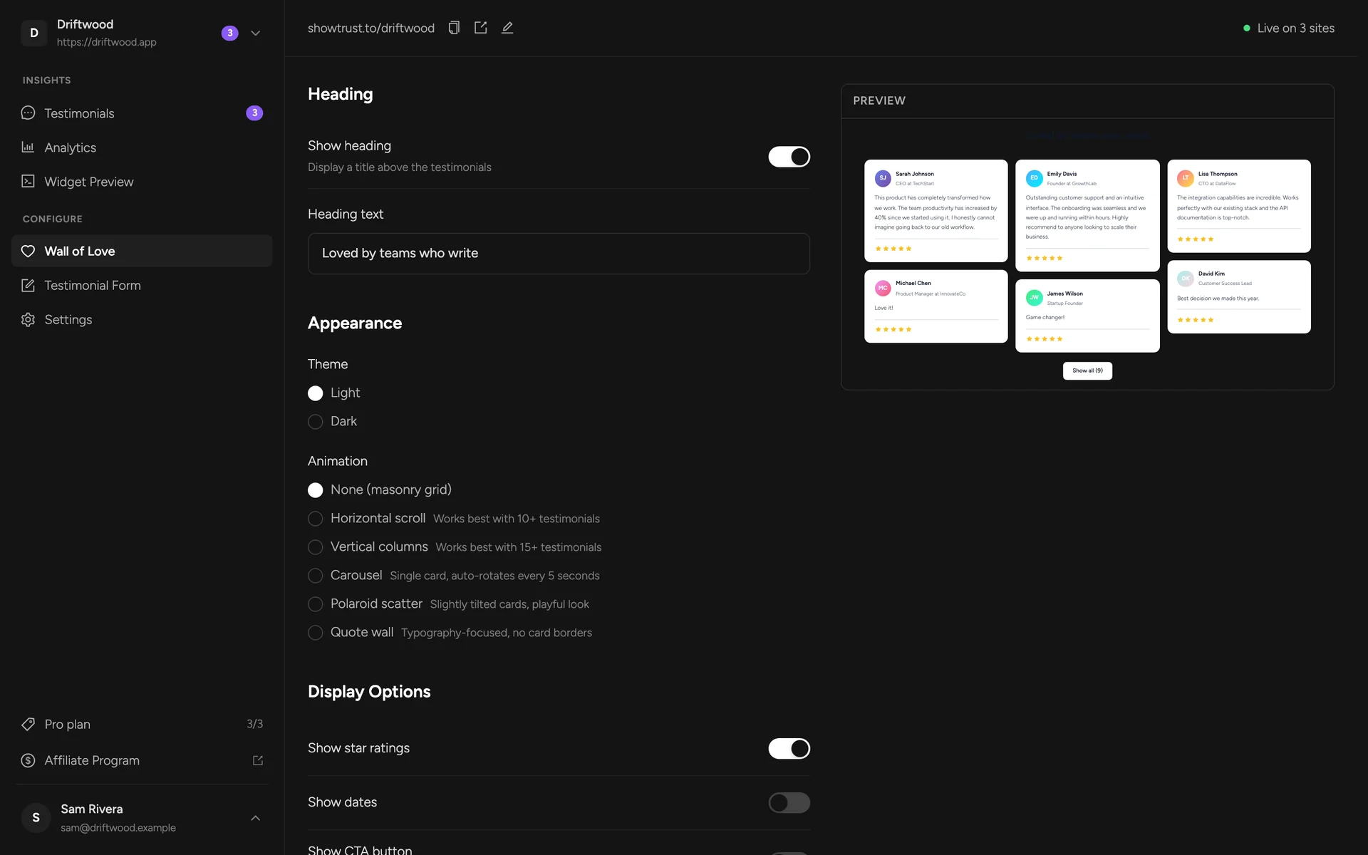
Settings are on the left, a live preview is on the right. The preview uses sample testimonials so you can judge the design at a glance; to see your wall with your real testimonials, open Widget Preview. Click Save Settings to publish your changes — your site picks them up within about five minutes (the widget is cached briefly so it loads fast).
Heading#
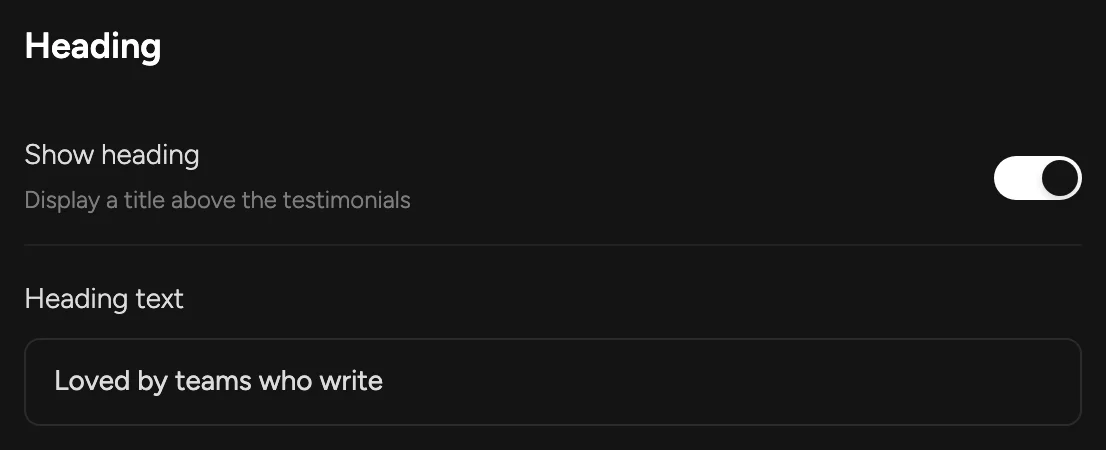
Show heading — a title above your testimonialsHeading text — leave empty for “What people say about {your project}”Appearance#
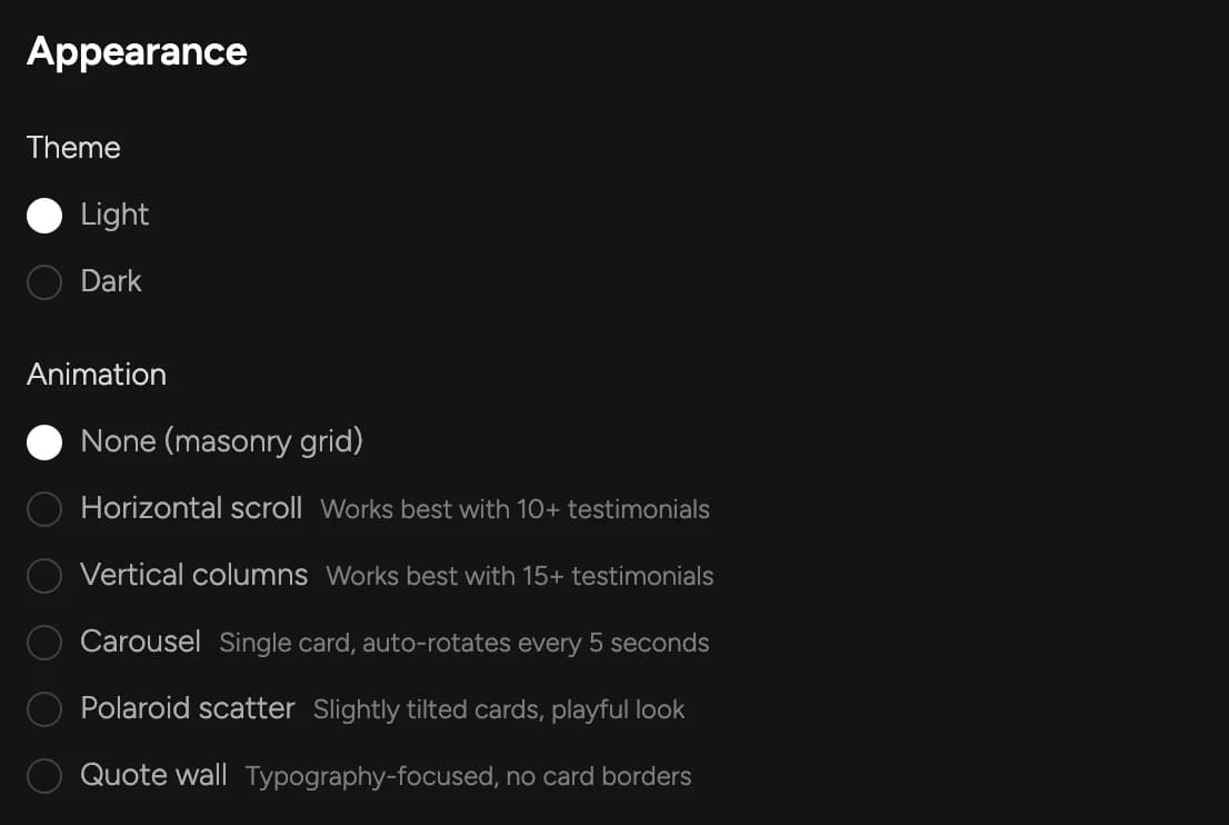
Theme — light or dark cards, to sit naturally on your pageAnimation — the layout of your wall (six options, below)- None (masonry grid) — a static, Pinterest-style grid. The default.
- Horizontal scroll — one row that scrolls sideways on its own. Works best with 10+ testimonials.
- Vertical columns — three columns scrolling up and down. Works best with 15+.
- Carousel — one testimonial at a time, rotating every five seconds.
- Polaroid scatter — slightly tilted cards, a playful look.
- Quote wall — typography-first, no card borders.
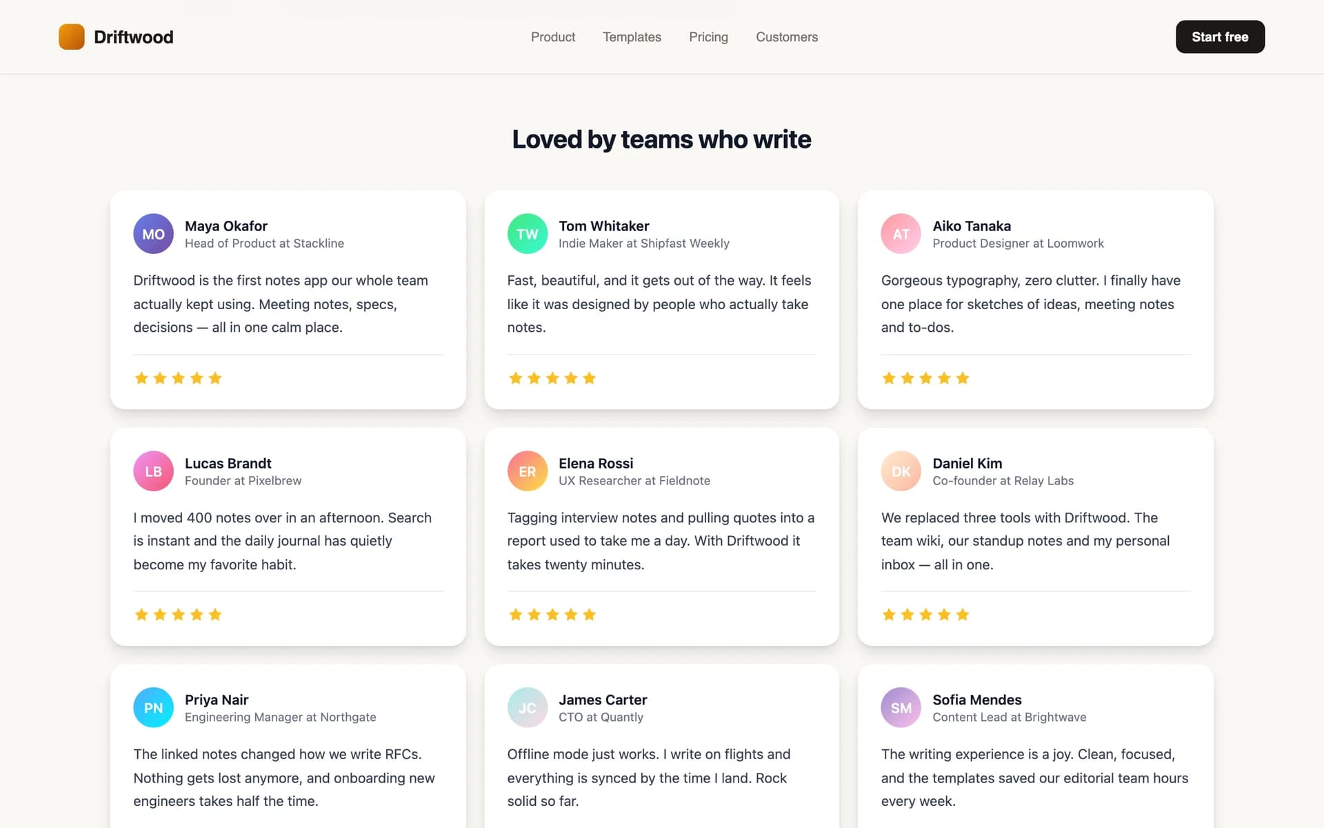
See every layout on a real page in Layouts & Styles.
Display options#
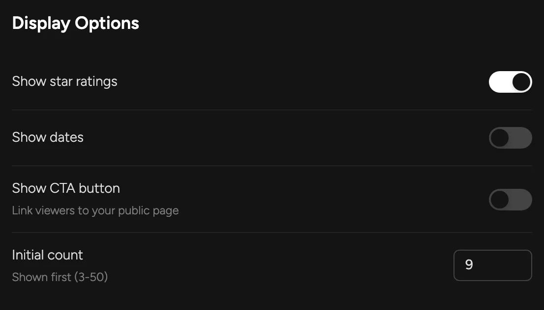
Show star ratings — each testimonial's ratingShow dates — when each testimonial was writtenShow CTA button — a button under the wall linking to your testimonial page, so visitors can add their ownInitial count — how many show before a “Show all” button (3–50)On the Free plan there's also Show ShowTrust credit, a small “Wall of love by ShowTrust” link under the wall. On Pro the credit is always off (white-label).
Card style#
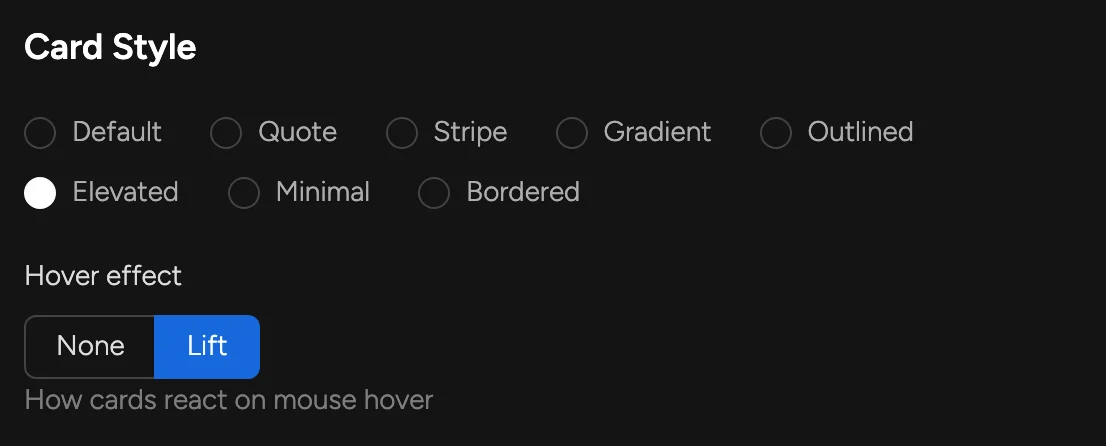
Hover effect — None, or Lift (cards rise slightly under the mouse)Palette#
The accent colour used by card decorations (stripes, gradients, quote marks): Neutral, Indigo, Emerald, Amber, Rose or Sky.

Size & spacing#
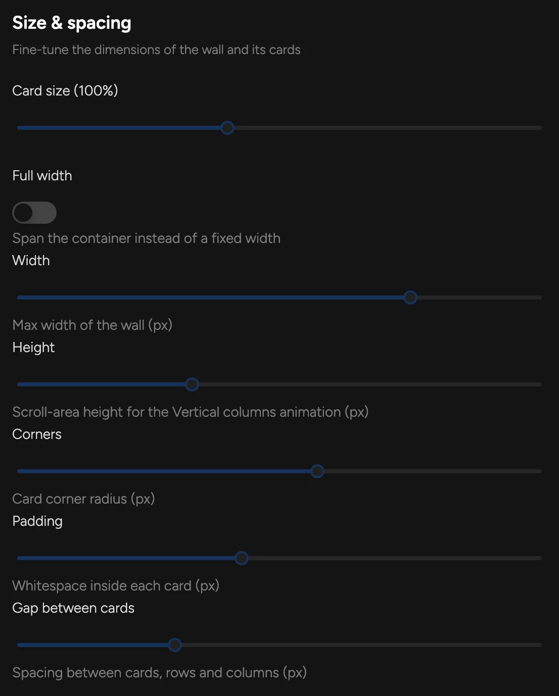
Card size — scales text, avatars and cards (80–130%)Full width — span the full width of the containerWidth — maximum width of the wall (600–1400 px)Height — visible height for scrolling layouts (400–1000 px)Corners — card corner radius (0–28 px)Padding — space inside each card (12–40 px)Gap between cards — (8–48 px)Embed code#
At the bottom of the editor are the two snippets you paste into your site. The script loads the widget (under 8 kB, no iframe); the container marks where the wall appears. You only paste them once — every later change in the dashboard shows up without touching your site again.
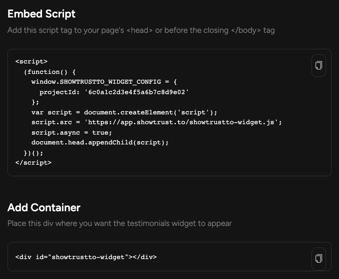
Framework-specific steps: Next.js (App Router), Next.js (Pages), Vite + React, Astro, plain HTML. Or let your AI agent do it: Agent Quickstart.
Embed options#
window.SHOWTRUSTTO_WIDGET_CONFIG accepts these keys. Only projectId is required; everything about how the wall looks is set in the dashboard.
projectId— your project's ID. It's filled in for you in the snippet the dashboard gives you.containerId— the ID of the element to render into. Defaults toshowtrustto-widget. If no matching element is found, the wall is added at the end of the page.allowCssOverride—truerenders the wall straight into your page instead of inside its own style boundary (a shadow root), so your stylesheet can style it. Off by default, which keeps your site's CSS and the wall's from affecting each other.
On the Free plan with the credit switched on, the container snippet includes the “Wall of love by ShowTrust” link inside the <div>. Keep it inside the container and the wall shows it in place under your testimonials. Turn the credit off (or upgrade to Pro) and the container is just an empty <div>.
Widget preview#
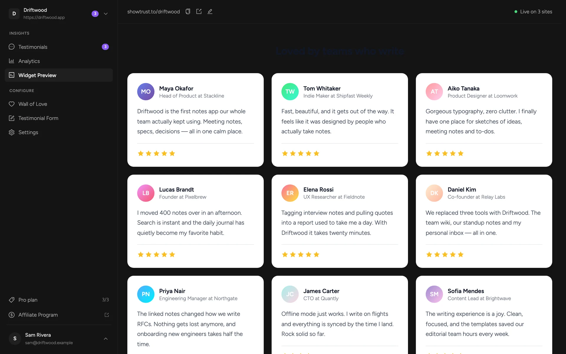
Widget Preview renders your saved wall with your real approved testimonials — pinned first — exactly as visitors will see it.