June 17, 2026
·
13 min read
How to Use Testimonials in Email Marketing: Placement and Formats
A pillar-style guide to using testimonials in email marketing for higher trust and clearer conversions—why social proof works in inboxes, which testimonial types to use, where to place them, how to format them, and how to write/design them for deliverability and compliance.
If testimonials work so well on landing pages, why do they often fall flat in emails? The inbox is cramped, skimmable, and full of distractions—so “nice words” alone rarely move readers to click.
This guide shows you how to choose testimonials that match your goal, place them where they actually support the decision, and format them so they’re readable on any device. You’ll also get practical writing, attribution, and deliverability rules—plus a checklist of mistakes that quietly erode trust.
Why Testimonials Work
A testimonial in email marketing is a short, customer-sourced proof point placed near a claim. It borrows real-world trust to reduce inbox skepticism and move readers from “sounds nice” to “I’ll click.”
Social proof basics
Testimonials persuade because credibility can transfer from the speaker to your offer. They work best when the reader recognizes themselves, and when the proof is specific enough to be checkable.
Email-specific constraints
The inbox punishes anything that looks slow, unclear, or salesy. Testimonials help, but only if they survive real email conditions.
- Skim-reading: readers scan, not study.
- Mobile layout: narrow screens clip long quotes.
- Image blocking: screenshots can disappear.
- Spam sensitivity: hypey language raises alarms.
- Short attention windows: interest evaporates fast.
Write testimonials to be readable as plain text, or they won’t count.
Mental model overview
Your email is a short argument, not a brochure. Testimonials are the proof layer that makes the argument feel grounded.
A simple model:
Claim → Proof → Relevance → Friction removal → CTA
Place testimonials in “Proof,” then use a tiny line of context to make them “Relevance.” That’s how you turn nice quotes into clicks.
Testimonial Types
Different testimonial formats prove different things. Pick the one that matches the doubt your reader still has, then make it easy to believe.
Quote testimonials
Quote testimonials work when your reader needs fast reassurance, not a full story. They fit tight spaces like headers, CTAs, and PS lines.
Keep the quote grounded with minimum context: full name, role, and company or credible alternative. Add the specific moment it refers to, like “after the first week,” not vague praise.
If you want a research-backed reminder of how little time readers spend before deciding what to read next, see Nielsen Norman Group’s findings on how people scan marketing emails.
Story testimonials
Story testimonials help when the objection is complex, emotional, or tied to switching costs.
- Problem: Name the painful before-state in one sentence.
- Decision: Show what triggered the change and why now.
- Experience: Describe onboarding, support, or day-one use.
- Outcome: State the practical “after” without precision theater.
- Fit: Say who should use it, and who shouldn’t.
If a reader can see themselves in the plot, your offer stops feeling like a gamble.
Data-lite testimonials
Data-lite testimonials add specificity without numbers, which keeps you credible and compliant. They’re great when you can’t verify metrics, or when metrics distract.
- Saved time on routine work
- Fewer mistakes in handoffs
- Smoother team onboarding
- More confidence in decisions
- Peace of mind under pressure
You’re selling the before-and-after feeling, not an audit trail.
Authority testimonials
Authority testimonials lean on recognizable signals like titles, brands, and domain credibility. They help when your reader is scanning for “is this legit?” before they read.
They backfire when the authority feels unrelated to your buyer’s world, budget, or constraints. A famous logo can scream “not for you” if the reader is a small team.
Review snippets
Review snippets work when you need volume and variety, especially in nurture sequences. Star ratings and short fragments can reduce perceived risk fast.
Keep context intact: show the platform, date range if relevant, and don’t rewrite wording into marketing copy. If you excerpt, use ellipses carefully and never change meaning.
It also helps to remember that buyers often glance at reviews and look for third-party validation—Baymard’s research explains why user reviews are less important than many teams assume.
Best Placement Spots
Testimonials work best when they behave like navigation, not decoration. Put proof where readers doubt, hesitate, or skim, and each placement does a different job.
Above the fold
Use a short proof line near your headline when your promise is bold or unfamiliar. It reduces the reader’s risk before they commit attention to the rest of the email.
Imagine a subject line that claims a big outcome. A one-line testimonial right under the headline can validate the premise fast.
You’re buying permission to keep reading. If you’re unsure what qualifies as above the fold in an email, define it as what’s visible before a scroll on the most common devices your audience uses.
Mid-body support
Mid-email testimonials should sit next to specific claims, not float between paragraphs. Treat them like citations for your strongest points.
- Under benefit bullets to validate outcomes
- Beside feature callouts to prove usability
- After objection sections to reduce anxiety
- Near comparisons to justify tradeoffs
- Under pricing mentions to anchor value
If the proof isn’t adjacent to the claim, it won’t be credited.
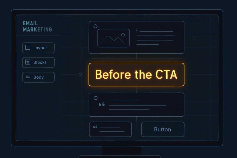
Before the CTA
Use a testimonial right before the CTA when the click feels like a leap. This is your last-mile nudge.
- Identify the biggest remaining objection to clicking.
- Choose a testimonial that answers that objection directly.
- Trim it to one tight sentence plus attribution.
- Place it immediately above the CTA button.
- Restate the CTA in the same language as the promise.
The click happens when doubt loses its last argument.
Post-CTA reinforcement
A second proof block after the first CTA catches skimmers who scroll past your body copy. It reassures without competing with urgency, because the button already did its job.
Keep it compact and aligned with the same intent as the CTA. Avoid adding new features or new offers down there.
You’re supporting the decision, not reopening it.
Footer trust cues
Footer proof should feel low-friction and administrative. It’s for readers who want safety signals before they reply, pay, or book.
- One-line testimonial with role or use case
- Support response-time expectation
- Refund or cancellation note
- Security or compliance mention
- Clear contact options and address
This is where hesitation turns into “okay, they’re legit.”
Email Format Patterns
Testimonials only work if people can read them fast. Your job is to make proof feel effortless on any client and screen. Tools like ShowTrust can help here by keeping the testimonial text and attribution clean and consistent, so you’re not rebuilding proof blocks from scratch every time you send.
One-line proof bar
Use a single compact line when you want credibility without breaking the scroll. It fits tight layouts and survives messy email clients.
A good proof bar looks like this: “Ava N., Ops Lead — ‘Cut onboarding chaos.’” Keep it to one line on mobile, usually 60–90 characters, and place it under the headline or right above the CTA.
If you’re pulling quotes from a testimonial library, keep the formatting standardized (name, role, outcome phrase) so your proof bars stay uniform across campaigns.
If it wraps twice, it stops being proof and starts being copy.
Card block layout
Cards make testimonials scannable while keeping structure consistent across clients.
- Put the quote first, 1–2 short sentences.
- Add attribution on a new line: name, role, company.
- Include an optional headshot, but never as the only identifier.
- Separate the card with a thin divider or extra padding.
- Align the CTA below the card, left-aligned for readability.
Build one card and reuse it everywhere. It helps if your testimonial management is curated (approved, organized, and easy to pull from) so the same card template can be populated reliably across sends. Consistency is the conversion feature.
Side-by-side layouts
Two-column testimonials can work, but only with strict guardrails. Most failures come from cramped typography.
- Stack to one column on mobile
- Cap container width at 600px
- Keep padding at 16–24px
- Use 14–16px body font minimum
- Avoid columns narrower than 260px
If you can’t guarantee stacking, don’t do two columns. Ship the single-column version.
Screenshot vs text
Screenshots can preserve formatting, but they hurt deliverability and accessibility. Text is lighter, searchable, and works with dark mode.
Use screenshots only for short, high-impact proof that would look messy in HTML, like a star rating snippet. Add alt text that includes the quote, and include a plain-text backup line right below.
If you’re collecting testimonials via a form or shareable link, prioritize storing the quote as text so it remains portable across email, landing pages, and any embed you use.
If your proof can’t be read by a screen reader, it’s not proof. It’s decoration.
Carousel alternatives
Carousels are fragile in email and break fast on older clients. You still can create variety without interactive code.
Rotate one strong testimonial across sends, and keep the layout identical. Or stack two to three micro-quotes in one email, each with a tight attribution, then link to a full review page for depth (a public “wall” of testimonials works well as a fast verification step).
Movement in email comes from sequencing, not widgets.
Matching Testimonials to Goals
Your testimonial format should match your email’s job, not your brand’s ego. Pick proof that removes the one biggest doubt blocking the click.
Welcome series
Email 1 is for trust, email 2 is for momentum, and email 3 is for clarity. Place proof where it answers the question the reader has at that moment.
- Email 1: credibility proof near your promise
- Email 2: onboarding confidence beside the first step
- Email 3: expectation-setting near outcomes and limits
If you reuse the same quote three times, you’re padding, not persuading.
Nurture and education
In education emails, testimonials should validate the lesson, not hijack it. Use a short proof line after the key idea, then point to an action.
Imagine you teach a simple workflow to reduce errors. Add a one-sentence testimonial that confirms the workflow helped, then link to a checklist or demo.
Proof is strongest when it reinforces the takeaway you want repeated.
Promotions and launches
Promotional emails need tight alignment between claim and evidence. Build proof blocks that support each promised benefit without turning urgency into pressure.
- List your top benefits in the order you pitch them.
- Add one testimonial under each benefit that matches the exact claim.
- Use urgency only when it’s true, and say what changes and why.
- Remove any quote that implies guaranteed results or universal fit.
When every claim has a receipt, your launch reads confident instead of loud.
Abandoned cart
Cart abandonment is usually about risk, not interest. Testimonials work best when they answer the silent objections around fit, quality, delivery, and getting help.
Use short quotes that mention specifics like sizing accuracy, packaging condition, setup ease, response time, or how returns felt. Put that proof right next to the button, not buried below the footer.
Your job is to make “what if” feel boring.
Renewal and upsell
Renewals and upsells need proof of sustained value, not first-impression excitement. Choose testimonials that speak to what happens after the honeymoon.
- Longer-term outcomes after regular use
- Team adoption and shared workflows
- Reliability under real workloads
- Support responsiveness when it matters
The best renewal proof sounds like operations, not hype.
Writing Strong Testimonials
Testimonials work in email when they read like a real person solving a real problem. Your job is selection and shaping, not hype.
Relevance filters
Pick testimonials that fit the reader’s moment, not your favorite quote.
- Match the audience: industry, role, maturity, and context.
- Match the use case: the exact job they’re hiring you for.
- Match the objection: price, risk, effort, switching, or credibility.
- Match the desired outcome: speed, quality, confidence, or clarity.
When one quote hits all four, it sells without sounding like selling.
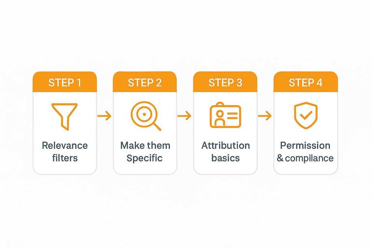
Make them specific
Specificity is the difference between “nice” and “believable.”
- Add before/after context, not just praise.
- Include situation details: team, workflow, and trigger.
- Name constraints: budget, timeline, or approvals.
- Mention alternatives considered, then why they switched.
- Keep concrete language: what changed, where, and how.
If a reader can’t picture themselves in it, it won’t move them.
Attribution basics
A testimonial needs enough identity to feel accountable. Include full name, role, and company when you can, and add location only if it boosts relevance.
Anonymous quotes read like copywriting, even when they’re true. If someone can’t be named, use a different proof type, like a screenshot or a verifiable review source.
Light editing rules
Edit for clarity and speed, not for persuasion. Cut filler, tighten long sentences, and keep the customer’s wording whenever possible.
Don’t swap in glossy marketing adjectives or change the claim. If you need to add context, bracket it outside the quote or add a one-line note beneath it.
Permission and compliance
Treat testimonials like content with legal and reputational weight.
- Get explicit consent for the exact use in email.
- Disclose edits, especially if meaning could shift.
- Disclose incentives, discounts, or affiliate relationships.
- Check industry rules: healthcare, finance, and regulated claims.
- Link to the original source if it’s publicly posted.
If you’re collecting fresh quotes, use a testimonial request email generator to ask cleanly and get permission in writing.
For the compliance baseline on disclosures and avoiding misleading endorsements, refer to the FTC’s Endorsement Guides.
Do it cleanly once, and you can reuse the quote for years without anxiety.
Design and Deliverability
Testimonials can lift trust fast, but email clients are picky. Design choices affect readability, accessibility, and whether your message lands in the inbox.
Accessibility essentials
Testimonials often arrive as “pretty quote cards,” and that’s where accessibility breaks. You want every reader to get the message, even with images off or screen readers on.
Use practical defaults:
- Set body text around 14–16px, with comfortable line spacing.
- Keep contrast high; avoid light gray on white backgrounds.
- Use semantic HTML: real text in
, emphasis in , not baked-in images.
- Add alt text for any decorative quote image, or mark it decorative.
- Make the CTA visually distinct from the testimonial block.
If your CTA looks like part of the quote, people hesitate or miss it entirely.
Image-to-text balance
Email filters and clients dislike image-heavy layouts, especially when the image carries the entire claim. Keep the testimonial readable as text first.
- Avoid image-only quote cards
- Include live HTML text quotes
- Keep images lightweight and compressed
- Keep a clear text-to-image mix
- Don’t hide key claims in images
If the quote survives with images disabled, you’ve already won half the deliverability battle.
Dark mode readiness
Dark mode can turn clean testimonial blocks into muddy boxes or invisible text. You’re designing for multiple color inversion rules, not one theme.
- Avoid transparent PNG quote cards over unknown backgrounds.
- Set explicit background colors on testimonial containers.
- Add a subtle border so blocks don’t disappear in dark mode.
- Define text colors instead of relying on defaults.
- Test in major clients using your saved templates.
Dark mode failures don’t look “slightly off.” They look broken.
Linking and tracking
A testimonial can point somewhere deeper, but every link adds friction and risk. Link when it completes the story, not because you can.
Use links deliberately:
- Link to full reviews when readers need volume and context.
- Link to a case page when the testimonial mentions specific use or results.
- Link to a product page when the quote addresses a buying objection.
- Keep links minimal, with one primary CTA and one supporting link.
One clear next step beats three “maybe” clicks every time.
Common Mistakes
Testimonials can boost trust fast, or backfire even faster. Most failures come from using them like decorations instead of evidence.
- Using generic praise; swap in a specific outcome or use-case
- Hiding context; add who, role, and situation in one line
- Over-editing the voice; keep quirks, tighten only for clarity
- Stuffing too many quotes; pick one, then support it with proof
- Forcing urgency; pair the testimonial with a calm, clear CTA
If a testimonial needs pressure to work, it’s not trust—it’s theater.
Put Testimonials on a Repeatable System
- Start with the email’s job: Decide whether the email needs trust, clarity, or urgency, then pick a testimonial type that reinforces that intent.
- Place proof where doubt appears: Use above-the-fold cues for skepticism, mid-body support for evaluation, and pre-CTA reinforcement for the final nudge.
- Choose a resilient format: Prefer text-first patterns (proof bar, card block, side-by-side) and treat screenshots as optional enhancements, not the only source of proof.
- Tighten relevance and attribution: Keep the quote specific, lightly edited, and clearly attributed; confirm permission and any compliance requirements before scaling.
- QA for inbox reality: Check dark mode, mobile spacing, accessibility, and image-to-text balance—then test links/tracking so proof supports the click you want.
Frequently Asked Questions
- Do I need permission to use customer testimonials in email marketing?
- Yes—get explicit consent and confirm how you’ll display their name, title, company, and any results mentioned. Keep a record of approval and avoid editing that changes the meaning of what they said.
- How many testimonials should I use in one marketing email?
- Usually 1–2 strong, specific testimonials are enough, placed near the claim or CTA they support. Using too many can dilute the message and make the email feel cluttered or salesy.
- Can I use testimonials in email marketing without using a customer’s full name or photo?
- Yes—use partial attribution (first name + company or role) or anonymize when required, but keep enough context to feel credible. If you can’t attribute at all, choose testimonials with very concrete details and match them tightly to the offer.
- What’s the best way to link from an email testimonial to proof people can verify?
- Link the name/company to a dedicated proof page (case study, review source, or a testimonials wall) so readers can validate quickly without hunting. A tool like ShowTrust can help you publish a clean, organized public testimonials page you can link to from email.
- How do I A/B test using testimonials in email marketing without changing too many variables?
- Hold everything constant and test one change at a time—such as testimonial vs. none, one quote vs. another, or attribution style—while keeping the same subject line and CTA. Compare downstream outcomes like clicks to the primary offer page, not just opens.
Turn Proof Into Conversions
Once you know the best testimonial formats and placement spots in email, the next challenge is collecting and organizing credible quotes consistently.
ShowTrust makes it easy to request, approve, and curate customer testimonials, then showcase them publicly and reuse them as high-trust proof in your email campaigns.
Written by
ShowTrust
Notes from the ShowTrust team on collecting testimonials and building authentic social proof.
Share: