June 20, 2026
·
7 min read
How a testimonial wall works for ecommerce buyers
An explainer on how testimonial walls influence ecommerce decisions—reduce buyer uncertainty, design the right testimonial anatomy, trigger trust mechanics, improve information design for scanning, and maintain freshness and coverage.

If your product page feels “good” but buyers still hesitate, the missing piece is often confidence, not information. People want to know the item fits their situation, the store is legit, and the outcome won’t be a regret.
A testimonial wall works because it compresses that uncertainty into fast, scannable proof—real names and context, recognizable use cases, and signals that feedback is broad and current. This explainer shows what to include, how buyers process it, and how to design it so it helps instead of backfiring.
What buyers need
Online, buyers can’t touch the product or watch your team pack the box. They still need a confident “yes” on fit, quality, delivery, and trust. A testimonial wall works when it turns other customers into usable evidence.
Uncertainty sources
Buyers aren’t hesitating because they’re indecisive. They’re missing specific facts that reduce risk.
- Will it perform as promised?
- Will it fit or be compatible?
- Will shipping be reliable?
- Will support and returns be painless?
- Will I get scammed?
If your wall answers none of these, it’s decoration, not proof.
Social proof shortcut
People borrow certainty from other people when they can’t test the product themselves. It’s a fast way to estimate outcomes with limited information.
Imagine buying a backpack online. Ten short notes about comfort, zippers, and carry-on fit beat one polished brand paragraph.
Your job is to make “people like me” easy to spot.
When it backfires
Testimonials can raise doubts when they amplify risk or feel irrelevant. In those moments, buyers read them like marketing.
- High-stakes purchases trigger deeper scrutiny
- Mismatched audiences make reviews feel staged
- Overly polished quotes signal curation
- Vague praise dodges real objections
- Uniform five-stars look unnatural
If skepticism rises, add specificity and context, not more praise.
Testimonial wall anatomy
A testimonial wall is a small interface with a big job. It compresses trust signals so buyers can decide without a long investigation.
Identity cues
Identity cues answer one question fast: is this a real person with real stakes. Buyers scan for details that are costly to fake, because that cost feels like honesty.
Names, photos, locations, and verification badges act like friction. The more consistent the identity feels across fields, the less your buyer has to “fill in” with optimism.
If identity looks generic, every other claim gets discounted. (For disclosure and authenticity expectations around endorsements, see the FTC’s Endorsement Guides.)
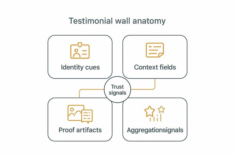
Context fields
Context turns a compliment into a diagnostic tool. Buyers want to know if the reviewer matches their situation.
- Product variant and size
- Use case and workflow
- Customer profile and constraints
- Purchase date and seasonality
- Prior alternative considered
Specific context turns “sounds nice” into “sounds like me,” which is where conversion happens.
Proof artifacts
Proof artifacts reduce doubt because they add constraints. A buyer trusts what has edges, not what floats.
Customer photos and videos show fit, scale, and finish in messy reality. Receipts, order snippets, and review-platform links add an external anchor, even if the buyer never clicks.
Hard-to-fake media doesn’t just persuade. It ends the argument.
Aggregation signals
Aggregation helps buyers stop reading sooner. It’s the difference between sampling forever and deciding.
- Total review count
- Average rating summary
- Recency of new reviews
- Spread across star levels
- Hints of common themes
When summaries look stable and recent, your buyer shifts from “is it safe” to “which option.”
Trust mechanics
A testimonial wall works because your buyer turns tiny snippets into a forecast. They aren’t collecting proof. They’re building a quick, usable belief about what will likely happen if they buy. Tools like ShowTrust tend to work best when they make that forecasting easy—by helping you collect real customer context and present it in a way prospects can verify quickly.
Heuristic pipeline
Buyers run a fast mental checklist because they don’t have time to investigate every claim.
- Notice: scan for names, photos, and standout lines.
- Assess authenticity: decide if it sounds like a real person.
- Assess relevance: check if the reviewer matches their situation.
- Infer outcome probability: estimate “will this work for me?”
- Decide: buy now, save for later, or bounce.
If your wall fails at step two or three, step four never happens. That’s why it helps when your testimonial workflow includes lightweight curation—approving, organizing, and displaying reviews in consistent widgets—so the “real person” and “this is for me” signals are easier to spot at a glance.
Authenticity detectors
People look for signals of a real human because fake praise is cheap and common.
- Specific details over generic superlatives
- Balanced tone with a small tradeoff
- Minor flaws in grammar or formatting
- Consistent voice across multiple reviews
- Concrete context like “gift” or “daily use”
The goal isn’t perfection. It’s believable imperfection. In practice, this is also why collecting testimonials via a simple prompt or form (instead of rewriting them into polished copy) can preserve the details and texture that read as authentic.
Relevance matching
Relevance is the multiplier because buyers anchor on similarity. If the reviewer looks like “me” or the use case matches, the praise feels predictive.
Imagine you’re buying running shoes for wide feet. A glowing review from a narrow-foot runner is noise. A mixed review from someone with wide feet is gold.
Your job is to help people find their “people” fast. That often means organizing testimonials by use case, customer type, or outcome—and displaying them in a way that lets prospects self-select the most relevant voices quickly (for example, on a public wall or embedded section that groups reviews by category). If you’re refining how you present reviews, it helps to understand the underlying core social proof concept that makes similarity feel predictive.
Information design
A testimonial wall is an evidence interface, not a scrapbook. Layout and interaction decide what gets noticed first, what feels credible, and what sticks.
Scanning behavior
Buyers skim before they commit. They hunt for fast signals that match their risk, like size, quality, or delivery reliability.
Many people scan in star patterns: headline, photo, first line, then the rating. A clear first line and a specific headline often earn the click into the full story. If your wall hides those anchors, your best proof never gets read.
Design for skimmers first, and readers will follow. (Related UX findings on review use and scannability: Baymard’s research on user reviews.)
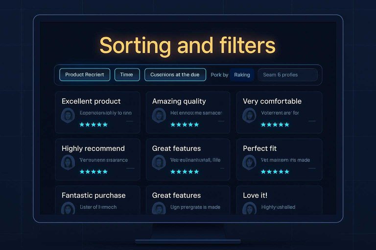
Sorting and filters
Give buyers control without making them work. Filters should mirror the questions they already have.
- Filter by product or variant
- Sort by rating and recency
- Filter by topic, like fit or durability
- Filter by customer attributes, like skin type
- Search within reviews for keywords
When the wall narrows itself, belief comes faster.
Placement logic
A wall lands differently depending on where it sits. Each page stage has a different buyer question.
On a PDP, buyers want “Will this work for me?” so lead with fit, use cases, and photos. On a collection page, they want “Which one should I click?” so show short snippets and aggregate signals. In cart and checkout, they want “Am I making a mistake?” so surface shipping, returns, and support experiences.
Match the wall to the moment, or it turns into noise.
Reducing friction
More proof can create more doubt if it feels endless. Use structure that makes depth optional.
- Use pagination or “Load more” over infinite scroll
- Expand long reviews on click
- Pin a short “Most helpful” cluster
- Highlight review summaries with links
- Collapse duplicates and near-identical comments
If you’re still deciding how to place and present proof across pages, see how to embed testimonials on your website.
Friction drops when the wall stops demanding attention.
Freshness and coverage
Recent, relevant testimonials feel trustworthy because they match what buyers are deciding right now. A huge pile of old, repetitive quotes can look like you stopped paying attention.
| Buyer question | What to show | What to avoid | Why it works |
|---|---|---|---|
| “Is this still good?” | Recent dates shown | Undated reviews | Signals active demand |
| “Will it fit me?” | Sizes, photos | Vague praise only | Reduces fit anxiety |
| “Will it arrive?” | Shipping outcomes | Generic “fast ship” | Answers logistics risk |
| “Is it worth it?” | Use-case specifics | Hypey superlatives | Feels grounded |
| “What if it breaks?” | Returns, support | Silence on issues | Shows accountability |
A testimonial wall should read like a well-covered FAQ, not a museum of compliments.
Turn your testimonial wall into a decision aid
- Start with buyer uncertainty: list the top 5 questions shoppers hesitate on (fit, quality, shipping, returns, durability) and make sure your wall has testimonials that answer each one.
- Upgrade the anatomy: add identity cues and context fields (who, what they bought, why, and where they used it), plus proof artifacts where appropriate (photos, order-verified badges, timestamps).
- Design for scanning: default to “Most relevant” and “Most recent,” provide filters (use case, size/skin type/room type, rating, verified), and place the wall where hesitation peaks (near price, variants, and add-to-cart).
- Keep it credible: avoid cherry-picking, surface a mix of opinions with your responses, and set a cadence to refresh and fill gaps so coverage stays broad and current.
Frequently Asked Questions
- Where should I place a testimonial wall for ecommerce—homepage, product pages, or checkout?
- Put the strongest, most relevant testimonials closest to the decision: short snippets on product pages and checkout, with a full testimonial wall linked for deeper proof. Keep homepage social proof high-level and route shoppers to category/product-specific evidence.
- Is a testimonial wall for ecommerce better than product reviews, or do I need both?
- You usually need both: product reviews answer item-level questions, while a testimonial wall communicates broader trust (service, delivery, support, overall satisfaction). Use the wall to summarize themes and point to detailed reviews where shoppers want specifics.
- How do I measure whether a testimonial wall is working on my ecommerce site?
- Track engagement (clicks, scroll depth, time on wall) and downstream behavior (add-to-cart rate, checkout completion) using GA4 events plus A/B tests. Also watch customer support tickets and return reasons to see whether key doubts are being reduced.
- Can a testimonial wall hurt conversions if it looks fake or curated?
- Yes—overly polished, repetitive, or anonymous testimonials can reduce trust. Use identifiable details (first name/initial, location, product context), mix in balanced specifics, and link to verifiable sources when possible.
- What’s the easiest way to collect and publish a testimonial wall for ecommerce without custom development?
- Use a social-proof tool that provides a request link/form, moderation, and an embeddable wall widget so you can publish updates quickly. ShowTrust is one option that covers collection, curation, and a public “wall” page you can embed on your storefront.
Build a Trust-First Testimonial Wall
Designing the right testimonial wall is only half the work—keeping it fresh, credible, and easy to scan takes consistent collection and curation.
ShowTrust helps you request, approve, and organize customer testimonials, then publish an embeddable wall and widgets that turn buyer doubts into fast, verifiable trust signals.
Written by
ShowTrust
Notes from the ShowTrust team on collecting testimonials and building authentic social proof.
Share: