August 21, 2026
·
10 min read
Why Your Testimonials Landing Page Isn’t Converting
A practical troubleshooter for diagnosing why your testimonials landing page isn’t converting—run conversion triage, tighten audience-message fit, rebuild credibility cues, map proof to objections, reduce structural friction, and clarify your CTA and offer.


If your testimonials page gets traffic but not sign-ups, the problem usually isn’t “more testimonials.” It’s that the proof isn’t doing a specific job: reducing doubt, answering objections, and guiding someone to a clear next step.
This troubleshooter helps you pinpoint what’s breaking—trust signals that are missing, messaging that doesn’t match the reader, quotes that feel vague or unverified, layout friction that hides the point, and CTAs that ask for the wrong commitment. You’ll leave with fixes you can implement quickly and prioritize by impact.
Conversion Triage
Spot the most common testimonial-page failure patterns before you touch the design. You’re mapping behaviors to credibility, clarity, or friction so you fix the right thing first.
Low trust signals
When bounce is high and time-on-page is short, visitors are making a fast “nope” decision. Few clicks usually means they don’t believe the page, or they don’t believe it applies to them.
Look for credibility gaps like anonymous quotes, vague roles, missing company context, and no specifics about the problem solved. Watch for “too polished” patterns too, like identical headshots, repetitive wording, or perfect five-star stacks with no nuance.
Trust dies in milliseconds, so you need proof that feels verifiable, not just positive.
High interest, no action
If scroll depth is high but CTA clicks are low, people are curious but unconvinced. They’re reading, then stalling.
Common causes are CTA mismatch, high-friction next steps, or unclear “what happens after I click.” Another culprit is a testimonial that proves satisfaction, but not fit, like praising support when buyers care about outcomes.
Your page can be interesting and still be unbuyable.
Quick checks list
Run a fast checklist before you change any copy. You’re looking for obvious leaks.
- Make the primary CTA visible without scrolling
- Confirm load speed and missing assets
- Validate mobile layout and tap targets
- Check for broken links, forms, and embeds
- Add proof context and simplify navigation
If any one is broken, optimization is just decoration.
Track the right data
Instrument the page so symptoms become measurable, not debatable.
- Track scroll depth at key sections.
- Fire CTA click events for every primary button.
- Log form errors and abandonment points.
- Review session recordings for hesitation and rage clicks.
- Build a simple view: landing → CTA → form start → submit.
You can’t prioritize what you can’t see.
Prioritize by impact
Don’t redesign from vibes. Rank issues by confidence and effort so you fix blockers before you polish.
Start with high-confidence, low-effort items like broken elements, unclear CTAs, and missing proof context. Save layout changes and full rewrites for after you’ve removed friction and confirmed where drop-offs happen.
Fix the system first; the creative comes later.
Audience-Message Fit
Your testimonials page can be “full of proof” and still fail if it’s proving the wrong thing. The goal is simple: visitors should recognize their role, their problem, and their stakes within seconds.
Define the reader
If your page tries to speak to everyone, it convinces no one. Anchor the page to the person who can approve the spend, not just the person who clicks around.
Start with a tight persona snapshot: industry context, role title, and what failure costs them. Then check every testimonial for that same worldview: priorities, language, and risk tolerance.
When the decision-maker sees their job on the page, proof starts to feel personal.
Mismatch symptoms
You can spot audience mismatch in behavior before you see it in copy. The visitor is telling you, “Not for me.”
- Skims fast and never slows
- Clicks back after one block
- Ignores CTA, hunts pricing
- Scrolls to logos, leaves
- Repeats the same section
If they don’t recognize themselves early, they won’t trust anything later.
Fix the positioning
You don’t need better testimonials first. You need a clearer promise around the ones you already have.
- Rewrite the headline to name the buyer explicitly.
- Rewrite the subhead to state the job-to-be-done.
- Add a one-paragraph intro with the expected outcome.
- Remove any line that could fit a different category.
- Match CTA wording to the same outcome.
When your top-of-page clarity improves, every quote below it lands harder.
Segment proof blocks
Visitors don’t read testimonials like a story. They scan for the one that matches their situation.
Group proof into labeled blocks like “For finance leaders,” “For implementation teams,” or “For agencies on retainer.” Use short intros per block to name the use case and what success looks like.
Make relevance findable, and your best quotes stop hiding behind your average ones.
Credibility Breakdown
Testimonials fail when they read like applause, not evidence. Your job is to turn “trust me” into “here’s why this is true,” without turning the page into a dossier.
Vague praise problem
Vague praise makes you sound like you’re quoting your own ad copy. Specificity makes it feel like a real person with a real constraint.
Empty: “Game-changer,” “amazing support,” “highly recommend.” Better: “We reduced manual handoffs from three tools to one,” or “Support replied in the same workday during onboarding.” Add light before/after context, the constraint, and one concrete detail.
If the reader can picture the situation, they can picture themselves buying.
Missing identifiers
Anonymous praise is cheap, even when it’s genuine. Add enough identifiers to make the source feel real and checkable.
- Full name and role
- Company name and industry
- Location or market served
- Headshot, or “photo withheld” note
- How they used your product
If you can’t show at least three, collect a better testimonial.
Verification cues
Believability spikes when a reader can verify with one click. You want lightweight proof, not a wall of links.
Add one strong cue per testimonial: a case study link, a public profile link, or a review-platform source. If you can’t link, add a permission note like “Shared with approval” or “Posted with permission.” Keep it consistent so the page feels curated.
The goal is frictionless checking, not endless browsing. Learn more about why endorsements should link to details so users can verify legitimacy in NN/g’s guidance on building trust and credibility.
Risk reversals
Risk kills conversions when your testimonials don’t answer “what if this fails for me?” Add explicit safety nets and expectations.
- Add a clear guarantee, or a plain refund policy.
- State security, privacy, or compliance basics you actually meet.
- Describe onboarding support and what’s included.
- Set expectations for effort, timeline, and prerequisites.
Credibility isn’t just proof you work; it’s proof you won’t punish the buyer for trying.
Proof That Persuades
Your testimonials page isn’t failing because the quotes are “bad.” It’s failing because the proof is unordered.
Visitors decide in a sequence, so your testimonials must answer objections in that same sequence. Tools like ShowTrust can help here by making it easier to collect, tag, and publish testimonials in a way that follows how prospects actually evaluate risk. (If you want a clearer framework for what counts as proof, see what social proof really means.)
Common objections map
People don’t read testimonials for vibes. They read them to de-risk a decision.
- Price feels too high
- Time to implement feels long
- Complexity feels overwhelming
- Switching cost feels painful
- Results feel uncertain
- Internal approval feels blocked
- Security feels risky
Order these like a decision path, and your page starts doing sales work. (It also makes it much easier to request specific testimonials later—e.g., asking customers to speak directly to “time to implement” instead of getting generic praise.)
Quote-to-objection matching
You’re not collecting quotes. You’re building coverage.
- Tag each testimonial to one primary objection.
- Delete duplicates that say the same thing.
- Add proof where an objection has no coverage.
- Reorder sections to match the decision sequence.
When every objection has a home, visitors stop “hoping” and start moving. This is where a simple workflow—collect via a shareable form, approve/curate, and organize by tags before you embed the set on-site—keeps the system from turning into a messy document.
Story arc layout
Random quotes feel like noise, even when they’re positive. A repeatable story shape makes proof legible fast.
Use a mini-arc: problem → attempt → why you → result → who it’s best for.
Once readers recognize the pattern, they scan for themselves. If you’re collecting testimonials through a structured prompt (instead of a blank “leave a review”), you’ll get more quotes that naturally follow this arc and are easier to place on the page.
Balance proof types
One format reads like cherry-picking. Variety signals reality.
Mix short quotes for speed, longer narratives for depth, screenshots for texture, and third-party reviews for distance.
If all your proof looks the same, it feels manufactured even when it’s true. A curated “wall” alongside embeddable widgets can help you present that variety without manually rebuilding the layout every time you add new proof.
Page Structure Friction
You can have great testimonials and still lose the click if the page makes proof hard to see. Most conversion drops come from layout choices that hide trust, bury CTAs, or overload mobile readers.
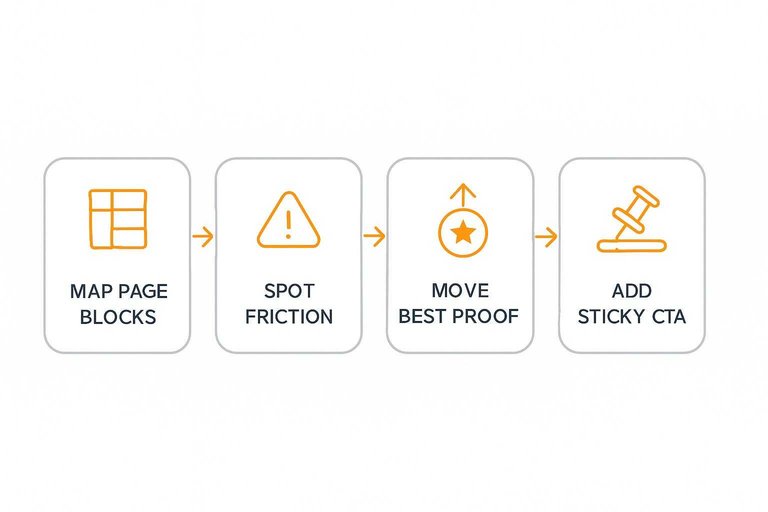
A fast way to spot friction is to map each page block to what the user needs next.
| Friction pattern | What users experience | Fix to try |
|---|---|---|
| Proof below the fold | Doubt lasts too long | Move best proof up |
| CTA buried at bottom | No obvious next step | Add sticky CTA |
| Carousel testimonials | Skipped, no scanning | Use stacked cards |
| Long wall of text | Cognitive overload | Break into chunks |
| Mobile layout mismatch | Pinch, scroll, quit | Design mobile-first |
If users can’t scan proof and act within seconds, your page is working against you—especially when key signals like trust badges and security icons are hard to spot. To quantify whether users even reach key blocks, use GA4’s enhanced measurement scroll event.
CTA and Offer Clarity
Your testimonials page can build trust, then waste it with a vague or risky next step. Make the click feel specific, low-commitment, and predictable.
CTA clarity check
A CTA is a promise, not a button label. Visitors decide based on what they think happens after the click.
“Book a demo” implies a scheduled call with a human and calendar effort. “See pricing” implies instant access and no commitment.
If your CTA implies one thing and your next screen delivers another, trust evaporates fast.
Offer mismatch symptoms
When people click but don’t finish, your offer and your ask are out of sync.
- High CTA clicks, low form submits
- High submits, low show-up rate
- “Pricing” CTA leads to a lead form
- “Free trial” requires a sales call
- Drop-offs spike on one field
Treat it like a stage problem, not a traffic problem.
Reduce form friction
Your form should only collect what you’ll use immediately. Every extra field is a tiny negotiation.
- Remove any field you won’t use on day one.
- Add inline validation, so errors don’t stack up.
- Show a time estimate near the submit button.
- Support autofill and sensible defaults.
- Offer an alternative contact path, like email.
Make the fastest path the most obvious one.
Microcopy that reassures
People hesitate when they can’t predict the downside. A few words near the CTA can remove imagined risk.
Add “No spam” only if it’s true, and back it with a preference option. Add “Cancel anytime” only if canceling is self-serve.
The best microcopy is specific enough to be enforceable.
Run the Fixes in Order, Then Re-test
- Triage first: Confirm the page has basic trust signals, a clear primary CTA, and clean tracking for clicks, form starts, and submissions.
- Lock audience-message fit: Rewrite the headline/lead for one defined reader and segment testimonials so each proof block matches that reader’s context.
- Strengthen credibility: Replace vague praise with specific outcomes, add identifiers and verification cues, and include a risk reversal where appropriate.
- Make proof persuasive: Map top objections to quotes, use a simple story arc (before → decision → after), and mix proof types (quotes, metrics, logos, case snippets).
- Remove friction + clarify the offer: Use the structure table to find bottlenecks, then simplify the form and add microcopy that answers “what happens next?”
- Re-test deliberately: Change one major area at a time, compare against the same traffic source, and judge success by CTA clicks-to-starts and starts-to-submits—not pageviews.
Frequently Asked Questions
- How many testimonials should a customer testimonials landing page include to improve conversions?
- Use enough testimonials to cover your top 3–5 buyer objections with variety (roles, use cases, company sizes), then stop. If adding more makes the page harder to scan or pushes the CTA down, you usually have too many.
- Should I put customer testimonials on a dedicated landing page or spread them across product and pricing pages?
- Most sites convert better when testimonials appear near the claim they support (feature, pricing, risk reversal) and also live on a dedicated customer testimonials landing page for people who want deeper proof. Use the landing page as the “proof hub,” then repurpose the strongest quotes where decisions happen.
- What’s the best format for a customer testimonials landing page: quotes, case studies, video, or screenshots?
- Video and structured case studies usually build the most trust, but only if they’re easy to skim with clear takeaways; short quotes work when they include specific outcomes and buyer context. Screenshots are fine as supporting proof, but add searchable text and attribution so visitors can verify quickly.
- How do I track whether my customer testimonials landing page is actually influencing conversions?
- Track micro-conversions (CTA clicks, form starts) and assist behavior (visits to pricing/demo after viewing the testimonials page) in GA4, plus scroll depth and section engagement in a session-recording tool like Hotjar or Microsoft Clarity. Also add UTM-tagged internal links from the testimonials page to your key CTAs to measure downstream impact.
- What’s the easiest way to collect and publish new testimonials without constantly redesigning the page?
- Use a workflow that collects testimonials via a shareable form/link, lets you approve and categorize them, and then publishes via an embed so updates don’t require dev work. Tools like ShowTrust can handle collection plus embeddable displays, which helps keep your social proof fresh and consistent.
Turn Proof Into Conversions
Fixing a customer testimonials landing page means more than adding quotes—it’s about collecting the right proof and presenting it with minimal friction for buyers.
ShowTrust makes it easy to request, curate, and publish testimonials as verifiable trust signals with embeddable widgets and a public proof wall—so your page persuades faster.
Written by
ShowTrust
Notes from the ShowTrust team on collecting testimonials and building authentic social proof.
Share: