June 19, 2026
·
11 min read
Testimonials Landing Page vs Homepage Section: Choose
A clear comparison to choose between a dedicated testimonials landing page and a homepage testimonials section — align traffic intent, message sequencing, trust/compliance needs, UX findability, and conversion-path measurement.
Should your testimonials live on their own page, or sit front-and-center on your homepage? The wrong choice usually isn’t about design—it’s about mismatched intent, missing context, and proof that shows up too early (or too late).
This comparison helps you pick the format that fits your traffic sources, narrative flow, and conversion path. You’ll learn when a standalone page earns its keep, when a homepage section does more work, how to handle credibility and permissions, and what to measure so the decision isn’t guesswork.
Decision context
You’re choosing between a standalone testimonials landing page and a testimonials section on your homepage. The decision matters when proof is doing conversion work, not just decoration. If visitors need reassurance before they click, placement becomes a lever.
What each option is
A testimonials landing page is a dedicated URL built to sell with social proof. It usually includes quotes, logos, roles, industries, and links to deeper stories.
A homepage testimonials section is a block inside your main page. Visitors reach it by scrolling, skimming, or jumping from the nav.
If your traffic arrives with doubt, the shortest path to proof wins.
Best-fit scenarios
Pick based on how people arrive and how much persuasion they need.
- Use a landing page for paid ads and campaign links
- Use a landing page for sales-led outbound and email sequences
- Use a homepage section for organic browsing and brand discovery
- Use a homepage section for product-led flows and in-app “learn more” clicks
- Use a landing page when proof must stand alone
Match the proof to the entry point, or you’ll fight the funnel.
Decision constraints
Budget and dev time decide how custom you can get. A homepage block is often quick, while a landing page can need design, copy, and routing.
Your CMS can also cap what’s realistic. Some setups make reusable testimonial cards easy, but filtering and tagging hard.
Compliance and approvals can slow everything. If legal needs disclaimers, redactions, or revocable permissions, simpler placements reduce risk.
Key success criteria
Use these criteria to evaluate both options before you build.
- Intent match to visitor stage
- Credibility of quotes and context
- Discoverability from nav and links
- Speed impact on load and LCP
- Maintenance effort for freshness
- Measurement clarity for attribution
- Risk from compliance and approvals
Your best choice is the one you can keep accurate and current.
Traffic and intent fit
Entry point decides the order of persuasion. Sometimes you need context first, sometimes you need proof first.
Cold vs warm visitors
Cold visitors arrive with a question, not a verdict. They need quick context before testimonials feel credible.
Warm visitors arrive with a shortlist. They want proof fast, because they already understand the offer.
Channels that favor pages
Some channels send people with a single, fragile intent. A dedicated testimonials page keeps that intent focused.
- Paid ads to specific offers
- Partner links from endorsements
- Email CTAs to “see results”
- Sales outreach follow-up links
If the click is expensive or personal, give proof a clean runway.
Channels that favor sections
Some channels send people already oriented to your brand. A homepage section answers “can I trust you” without a detour.
- Brand search visitors
- Navigation-driven browsing
- Direct traffic from bookmarks
- Internal links from content
When people are already on your doorstep, reduce clicks, not context.
Intent-matching questions
You choose the format by matching the visitor’s intent, not your preference. The right proof is the proof that answers the next doubt.
Ask:
- What promise brought them here?
- What objection blocks the next click?
- What proof would settle that objection?
Write the page or section around those answers, then measure drop-offs. If you need a lightweight way to validate objections, consider using on-site surveys to increase conversions.
Message and narrative
Context before proof
Testimonials land harder when your reader already knows the role you play. Without that frame, the quote feels like noise.
Use surrounding explanation when your offer has multiple audiences, multiple outcomes, or a non-obvious mechanism. Add one tight paragraph that clarifies who it’s for, the use case, the differentiator, and the kind of result to expect.
If visitors can’t place themselves in the story, they’ll discount the proof.
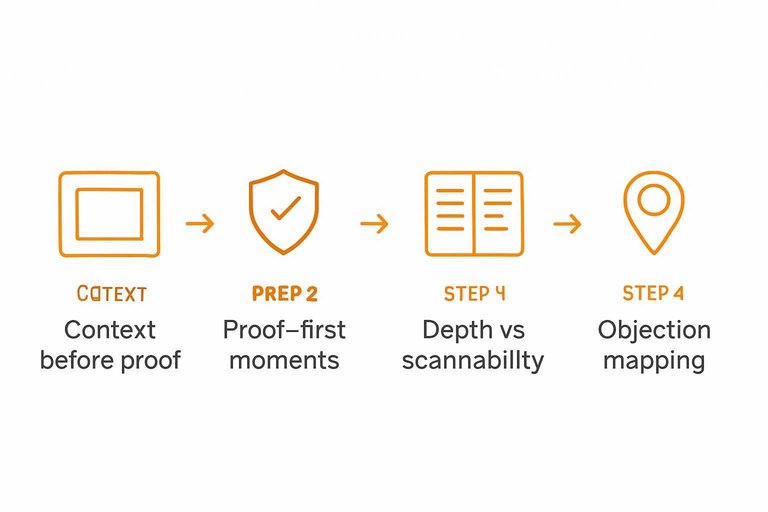
Proof-first moments
Sometimes you lead with proof because the visitor is already defensive. You need credibility before you ask for attention.
- Visitors arrive from comparison searches
- Your offer looks like a commodity
- You have recognizable customer logos
- Your sales cycle is short
- You’re fighting “too good to be true”
In these moments, proof is the hook, not the garnish.
Depth vs scannability
A homepage section is for momentum, not nuance. It should confirm the core promise fast, then get out.
A dedicated testimonials page can carry the heavier narrative. Longer stories, industry filters, before-after context, even format variety like video or screenshots. If you’re building one, see a customer testimonials landing page approach.
Keep the homepage skim-friendly, then let the proof page do the convincing work.
Objection mapping
Different objections need different proof. One generic quote can’t do five jobs.
- Risk: detailed case-style testimonial
- Time: timeline and milestones quote
- Results: specific outcome narrative
- Fit: same-industry or same-role quote
- Support: onboarding and responsiveness quote
Match one objection to one proof block, then place it near the related claim.
Trust and compliance
A testimonials landing page can carry heavier proof, richer attribution, and clearer context. A homepage module has less space and more risk, so claims must be tighter and simpler.
Your goal is the same in both places: believable trust signals without crossing legal lines.
Credibility ingredients
More detail increases trust, but it also increases scrutiny. Pick the elements you can support, then scale up on the dedicated page.
- Full name and role
- Company and location
- Photo or avatar
- Specific outcome details
- Verifiable context and date
If you can’t verify it, don’t amplify it on the homepage.
Editing and authenticity
Light editing is fine when it removes friction, not meaning. The moment you reshape intent or inflate a claim, you’re writing marketing copy.
Keep edits to spelling, filler words, and obvious clarity fixes. Preserve qualifiers like “for us,” “so far,” and “in our case.” Never merge two customers into one “perfect” quote.
Your safest testimonial still sounds like a human, not a headline.
Permissions and policies
Permissions differ by surface area and claim strength. A landing page usually needs broader rights, since it will be linked, shared, and scrutinized.
- Get written consent for the quote and attribution.
- Define usage scope: page types, ads, email, social.
- Confirm logo rights separately from the quote.
- Set a review cycle for updates or removals.
- Route regulated claims through required approvals.
Do the paperwork once, and you can reuse proof without fear.
Handling negative nuance
Balanced quotes can be more credible than perfect praise. They work best on a dedicated page, where you can add context and avoid cherry-picking.
Include nuance when it prevents overpromising, like “setup took work” or “not for every team.” Add “before/after” context when a quote could imply guaranteed results.
Honest constraints reduce refunds, disputes, and compliance headaches.
UX and information architecture
Users don’t hunt for proof. They scan until they feel safe, then click.
Your job is to place testimonials where attention already goes, and where the next CTA is obvious. Tools like ShowTrust can help here—not by changing the strategy, but by making it easier to curate the right proof and display it consistently wherever doubt shows up.
Homepage placement options
You’re balancing two needs on the homepage. Build belief fast, and keep the page moving.
- Above the fold, beside the core claim
- Mid-page, after the value proposition block
- Near a pricing teaser or plan comparison
- Adjacent to the primary CTA module
Place proof where doubt appears, not where you have leftover space. If you’re using a system like ShowTrust to manage and embed testimonials, it’s simpler to keep these modules updated without redesigning the page every time you add new proof.
Landing page structure
A testimonials landing page works when it reads like a guided evaluation. Each block answers one question, then hands users forward.
- Lead with a clear headline and promise.
- Specify who it’s for, with sharp qualifiers.
- Group proof into clusters by use case.
- Add mini-stories with context and outcomes.
- Cover objections with tight FAQs.
- Put a strong CTA with low-friction next step.
- Finish with secondary proof, then the final CTA.
Treat it like a product page for trust. It also helps when you can quickly approve, organize, and publish testimonials in those clusters, so the page stays current as new feedback comes in.
Findability and linking
A testimonials page fails if it’s hidden behind “Company” menus. Link it where buying decisions happen, and where objections surface.
From your homepage, add a “See customer stories” link near the first proof block. From pricing and product pages, link it beside high-commitment CTAs, especially near plan comparison or feature claims. From blog posts, link it contextually when you mention results, pain points, or implementation concerns.
Make proof a first-class route, not a footer surprise. If you maintain a public testimonials “wall” (for example, via ShowTrust), it gives you a stable destination you can link to across the site while still rotating and curating the proof behind it.
Mobile scanning behaviors
Mobile users skim harder and commit later. Design testimonials like a readable feed, not a desktop collage.
- Keep quotes short, front-load the result
- Prefer stacks over carousels for faster scanning
- Use generous tap targets on logos and links
- Load text first, defer heavy media
- Increase line-height and contrast for readability
If it’s annoying to scroll, it’s ignored. This is where lightweight, mobile-friendly testimonial embeds can outperform custom layout experiments—especially when you can control length, ordering, and what displays by default. (For a broader set of patterns, see Baymard’s user reviews section design examples.)

Conversion path impact
Your testimonials placement should reduce decision friction, not add reading work. The right option keeps attention on the next click: signup, demo, checkout, or contact.
CTA alignment
Testimonials work best when they match the action you want next. Keep the CTA, audience, and promise identical across the proof and the button.
If your quotes say “fast onboarding,” your CTA should not say “Explore features.” Use the same nouns, same outcome, same buyer language.
When a page distracts
A dedicated testimonials page can help, but it can also steal momentum. Watch for these common conversion-killers.
- Endless scrolling replaces decision-making
- Rabbit holes pull visitors off-path
- Weak CTAs leave no next step
- Lost product context raises doubt
- Competing navigation invites exits
If the page can’t earn a click in one screen, it’s probably a detour.
When a section underdelivers
A homepage section is fast, but it can feel like wallpaper. These issues make proof easy to ignore.
- Too shallow to reduce risk
- Generic quotes lack specificity
- Hidden below fold goes unseen
- Carousel blindness lowers attention
- No segmentation confuses audiences
If nobody can see themselves in the quote, they won’t trust the button.
Hybrid path patterns
Hybrids usually convert best because they respect attention and still offer depth. Use a tight homepage strip with one clear CTA, then link to a structured proof hub.
On the deeper page, segment by persona, use-case, or product tier. Keep each segment paired with the same next step.
Measurement plan
You can’t compare a testimonials landing page to a homepage section without shared definitions and clean attribution. Measure both with the same events, the same traffic rules, and the same conversion window. Otherwise, you’re just measuring noise.
Primary success signals
Track signals that connect attention to action, not vanity engagement.
- CTA clickthrough rate to next step
- Lead quality from downstream qualification
- Time-to-next-step after viewing testimonials
- Assisted conversions with testimonial touch
- Scroll depth past testimonial block
If the testimonials change intent, these numbers move before revenue does.
Instrumentation basics
Set up tracking once, then reuse it for both placements.
- Define events for view, scroll, click, and submit.
- Tag all testimonial CTAs with consistent UTMs or link IDs.
- Set funnels from testimonial view to next-step completion.
- Segment results by channel, device, and returning status.
- Exclude internal traffic and known test sessions.
When tracking is boring and consistent, your test results stop being debatable.
Testing approaches
Use A/B testing when you can randomize traffic to either a homepage variant or a dedicated landing page. Use split-path testing when the homepage stays stable, but you route specific campaigns to one path or the other.
Control for traffic sources and intent, because ads, email, and organic visitors behave differently. Don’t peek early or run overlapping experiments that touch the same CTA, or you’ll blur causality.
Qualitative validation
Numbers tell you what happened. Qualitative data tells you why.
- On-page poll: “What’s stopping you?”
- Session replays focused on testimonial area
- Sales feedback on objection shifts
- Support tickets mentioning trust concerns
- Quick customer interviews after conversion
If qualitative signals agree with metrics, you can ship with confidence. For deeper diagnosis, apply funnel analysis to see where intent drops between steps.
Make the Choice, Then Measure It Like a Product
- Choose a testimonials landing page if you need depth (multiple segments, objections, formats), plan to send traffic directly to proof, or must document permissions and context clearly.
- Choose a homepage section if your homepage is the primary entry point and you need fast, scannable reassurance that supports the main CTA without pulling people off-path.
- Use a hybrid when you want both: a tight homepage module that links to a structured proof page (by audience, use case, or objection).
- Validate the decision with a simple measurement plan: track CTA clicks and downstream conversions from each placement, monitor scroll/engagement on the proof area, and collect qualitative feedback (sales notes, session replays, on-page prompts) to confirm the testimonials answer real hesitations.
Frequently Asked Questions
- What should a customer testimonials landing page include besides quotes?
- Include clear customer identifiers (name, role, company), a short problem→result storyline, proof artifacts when available (screenshots, links, case studies), and a single primary CTA that matches the next step (demo, trial, checkout). Add filters by use case or persona so visitors can find “someone like me” fast.
- Should I put pricing on a customer testimonials landing page?
- Usually no—keep the page focused on credibility and route visitors to pricing via a secondary link or CTA if it’s a common next question. If price objections are your main blocker, add a small “Pricing & plans” module near the CTA instead of turning the page into a pricing page.
- How do I structure testimonials for different audiences (SMB vs enterprise) on one page?
- Group testimonials by segment (industry, company size, job role, use case) and surface segment-specific highlights above the fold, then let visitors filter or jump via anchors. Keep each segment’s CTA consistent with the path you want that audience to take (e.g., “Book a demo” for enterprise).
- Can I use video testimonials on a customer testimonials landing page, and do they help more than text?
- Yes—video often builds trust faster, but only when it loads quickly and includes captions plus a text summary for skimmers. Use one “hero” video near the top and keep the rest as optional thumbnails so the page doesn’t become a distraction sink.
- What’s the easiest way to collect and publish testimonials for a customer testimonials landing page without heavy dev work?
- Use a tool that provides a shareable request form, moderation, and embeddable widgets so you can add new proof without redesigning the page each time. ShowTrust is one option that can collect testimonials and publish a public wall or embeds you can drop into your landing page.
Turn Testimonials Into Conversions
Choosing between a dedicated testimonials landing page and a homepage section is easier when collection, curation, and publishing are consistent and measurable.
ShowTrust helps you request testimonials, curate the best quotes, and publish them as embeds or a public wall—so prospects can verify credibility fast and move confidently to your conversion path.
Written by
ShowTrust
Notes from the ShowTrust team on collecting testimonials and building authentic social proof.
Share: