June 5, 2026
·
Updated June 9, 2026
·
11 min read
How a Customer Testimonials Landing Page Builds Trust
A pillar guide to building a customer testimonials landing page that actually earns trust—understand trust mechanics, map intent and page purpose, craft high-credibility testimonial anatomy, and design a proof-backed trust stack with strong IA, visuals, and ethical compliance.
If your testimonials page feels like a wall of praise, it may be doing the opposite of what you want: raising suspicion instead of reducing risk. People don’t need more adjectives—they need reasons to believe.
This guide shows you how to turn testimonials into a trust-building landing page with a clear job, the right proof for each objection, and a skimmable structure. You’ll learn what makes quotes credible, how to layer proof in the right sequence, and how to stay truthful and compliant.
Trust Mechanics
Trust is your visitor’s willingness to act before they can fully verify the outcome. In conversion terms, it’s confidence under uncertainty, not blind belief. A testimonials landing page works because it reduces perceived risk using other people’s experience as evidence.
Uncertainty and risk
Buyers hesitate when the downside feels bigger than the upside, or when details stay fuzzy. Pricing, implementation effort, reliability, and “will this fit me?” all create ambiguity. When they can’t test the promise quickly, they look for signals from people who already took the leap.
If you can’t remove uncertainty, you can at least show how others navigated it.
Signal credibility cues
A testimonial feels believable when it answers, “Could this be real?” and “Could this be me?”
- Specific details over slogans
- Clear identity and context
- Meaningful stakes and tradeoffs
- Easy ways to verify
- Balanced tone, not hype
When two or more cues are missing, readers assume marketing wrote it.
Why testimonials work
Testimonials compress your buyer’s research into a story they can borrow. Social proof says, “People like you chose this,” which lowers the fear of being first. Similarity bias and light authority transfer make the signal stronger when the person matches the visitor’s role, industry, or constraints.
Good testimonials don’t just claim results; they make doubt feel expensive to keep.
— Section 1: Page Purpose —
A customer testimonials landing page is a dedicated page built to answer one question: “Can I trust you?” It curates proof in one place, with a clear narrative and a clear next step. Unlike a homepage, it doesn’t try to explain everything; unlike a product page, it doesn’t lead with features; unlike a review widget, it isn’t buried or generic. For a step-by-step blueprint, see build a SaaS testimonials landing page.
Jobs-to-be-done
People don’t come for inspiration. They come to reduce risk.
- Validate your main claim with real experiences
- Compare you against alternatives they’re considering
- Anticipate outcomes, friction, and tradeoffs
- Justify the purchase to a boss or partner
If you can’t help them explain the decision, you’re not building trust.
Traffic intent mapping
Where the click comes from shapes what proof feels convincing. A prospect from an ad needs fast credibility, while a prospect from a sales email wants confirmation of specifics.
A simple rule: the more “cold” the traffic, the more you lead with signal, not detail.
Promise and framing
Set expectations before the first scroll.
- Write a headline that states the core outcome you enable.
- Add an audience qualifier so visitors can self-select quickly.
- Preview the proof above the fold with 2–3 concrete snippets.
- Place a low-friction next step beside the preview.
When the framing is tight, every testimonial reads like evidence, not noise.
Testimonial Anatomy
A testimonial earns trust when it reads like a real decision, not a marketing line. Skeptical readers look for specifics, identity, and proof before they believe praise—and the way you collect and present that proof matters as much as the quote itself. Tools like ShowTrust can help you capture the context around a testimonial and then surface it consistently, so the trust signals are easy to scan and verify.
Specificity over praise
Generic praise feels interchangeable, so readers treat it like copy. Concrete details anchor the story in a real situation with real constraints.
Name the trigger, the limitation, and the result in plain language. For example: “We needed approvals in one place, but legal required audit logs,” beats “Amazing platform.”
Specifics don’t just persuade. They let the reader self-qualify fast—and they’re easier to collect reliably when your request form prompts customers for the “before/after” details instead of leaving them to write a one-line compliment.
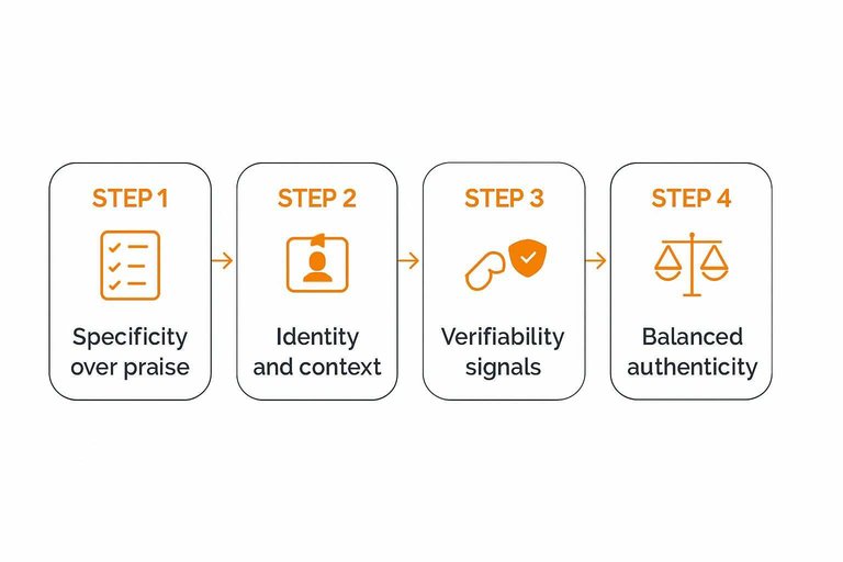
Identity and context
Readers trust people, not faceless blurbs. Give enough identity and context for someone to say, “That’s like me.”
- Full name
- Role or title
- Company name
- Industry or segment
- Location and use-case context
If the identity can’t be shared, add stronger context. Otherwise it looks like a hiding place. A simple approval-and-curation step (so you can confirm what’s okay to publish) also helps you keep identity details accurate without over-editing the voice.
Verifiability signals
Skeptical readers scan for proof they can check in seconds. The goal is not “perfect verification.” It’s reducing the feeling of being tricked.
Add light-touch signals: a link to a public profile, a company site link, a screenshot of the submitted quote, or a short note like “Shared with permission.” If you redact details, say why.
The easiest way to lose trust is to look like you’re afraid of being verified. It also helps when your testimonial display makes these signals visible by default—e.g., consistently showing names, roles, and optional profile links wherever the testimonial appears (on a page or embedded widget), rather than hiding them in a separate “case studies” corner.
Balanced authenticity
Perfect stories feel fake, especially to experienced buyers. Add nuance so the reader can map your product to their reality.
- Write the before-state in one concrete sentence.
- Name one tradeoff or constraint you had to accept.
- Say who it’s not for, without hedging.
- Describe a realistic timeline using relative language, not promises.
Nuance doesn’t weaken the testimonial. It makes it usable. When you’re managing multiple testimonials, keeping these elements intact during review/approval (instead of polishing them into marketing copy) is often what preserves the credibility in the final published version.
— Section 3: Trust Stack Design —
A testimonials landing page works best when proof arrives in layers, not in isolation. Each layer answers a different doubt, and together they reduce the feeling of risk.
Proof type spectrum
Different visitors need different proof because they arrive with different fears.
- Customer quotes
- Video testimonials
- Case narratives
- Customer logos
- Ratings and reviews
- Expert mentions
- User-generated content
If you only show one type, you only resolve one kind of doubt.
When each works
Each proof type targets a specific objection, so match format to hesitation.
Quotes often reduce fit anxiety because they sound like your buyer’s inner monologue.
Video builds reliability because it’s harder to fake, while case narratives signal competence through specifics.
Logos and ratings create quick safety through social consensus, and expert mentions reduce perceived risk.
Map proof to the doubt you hear most, then add the next layer that answers the second-most common doubt.
Sequence for belief
Order proof like a conversation that starts broad and ends personal.
- Start with logos, ratings, or recognizable consensus.
- Follow with quotes from customers who resemble your target.
- Add one or two deeper case narratives or videos.
- Address safety concerns near the CTA with guarantees or policies.
- Place a clear CTA after the deepest proof block.
The goal is momentum, not volume, so remove anything that breaks the belief chain. If you need a quick way to reinforce safety near the CTA, try a trust badge generator to create a clear visual cue. If you’re deciding how to format and place embedded proof across your site, see how to embed testimonials on your website.
Information Architecture
A testimonials page wins when visitors can quickly find “someone like me.” The right structure lowers cognitive load, so trust can form without effort.
Segmentation filters
Filters turn a wall of praise into a map. They help visitors narrow fast, without guessing where to click.
- Role or job title
- Company size band
- Industry or vertical
- Goal or use case
- Feature or workflow used
- Objection or risk addressed
If your filters match real buying questions, the page starts answering before sales does.
Skimmable patterns
Most visitors skim first and commit later. Your layout should reward scanning, then invite deeper reading.
Use clear headings that name the situation, not the brand. Add pull-quotes that capture the before-and-after tension. Present stories as cards with a one-line takeaway and key context fields. Include short summaries up top, so the full story feels optional.
When people can triage in seconds, they’ll spend minutes on the few that matter.
Deep-dive paths
Build layers so each click earns more detail.
- Write a 2–3 sentence excerpt with the core result and context.
- Expand to the full story with problem, decision, and implementation.
- Attach supporting artifacts like screenshots, docs, or a short walkthrough.
- Link to related testimonials using the same segment tags.
Layering keeps the page lightweight for skimmers, while giving proof-hungry buyers somewhere to go.
Visual Credibility
Words rarely fail alone. Presentation fails them.
On a testimonials landing page, design polish, media choices, and microcopy act like body language. They signal whether your evidence is real, current, and responsibly shown.
Face and voice effects
Text is easy to fake, so readers look for human cues. Faces, voices, and natural imperfections reduce the “marketing puppet” feeling.
Video clips, headshots, or short audio snippets add identity signals: age, tone, cadence, emotion, and context. Even small details help, like a real background, a spontaneous laugh, or a slightly imperfect delivery.
If your proof feels human, skepticism drops before they read a single adjective.

Avoiding “stock” vibes
People aren’t scanning for beauty here. They’re scanning for patterns that look manufactured.
- Generic portraits with no context
- Identical lighting across “different” customers
- Over-edited video with unnatural smoothing
- Template-y quotes with perfect cadence
One red flag can taint the whole set, even if the words are true.
Microcopy for trust
Microcopy is your ethics layer. It tells readers you’re not hiding the editing, the sourcing, or the fine print.
Consent notes (“Shared with permission”), light qualifiers (“Individual outcomes vary”), and sourcing labels (“Email reply,” “Post-call note,” “Review platform”) reduce manipulation concerns. They also frame what’s curated versus what’s verbatim.
Add the small honesty signals early, and you won’t need to “convince” later—and if you’re publishing testimonials as reviews, using a review schema generator tool can help present them responsibly to search engines. For practical compliance context, see the FTC’s guidance on endorsements, influencers, and reviews.
Objection Coverage Map
Happy-customer quotes are pleasant, but they rarely close the sale. Your testimonials page should answer the hesitations buyers carry into the click: “Will this work for me, and what will it cost me?”
Build an objection coverage map before you redesign anything. Otherwise, you’ll collect praise while prospects still stall.
Common hesitation themes
Prospects hesitate for predictable reasons, even when they like your product. Name the themes so you can hunt for proof on purpose.
- Price and ongoing cost
- Setup effort and time
- Switching risk and downtime
- Support quality and responsiveness
- Security and compliance comfort
If you can’t tag a quote to one of these, it’s probably not revenue-proof.
Matching proof to objections
Treat testimonials like labeled evidence, not wallpaper. Tag each one by the objection it resolves, then place it where doubt spikes.
Imagine your pricing section says “Simple tiers.” Put a price-clarifying quote right under it. Place a “switching was painless” quote beside the migration CTA. Put a “support saved us” quote next to the “Contact support” promise.
When proof sits next to friction, your copy stops arguing and starts confirming.
Gap-filling workflow
You won’t cover every objection from whatever quotes you already have. Create a repeatable workflow to harvest missing proof.
- Interview recent customers who almost didn’t buy.
- Ask what nearly stopped them, then what changed their mind.
- Extract short quotes tied to one specific objection.
- Add tags and place quotes beside matching page sections.
- Review quarterly and replace weak, generic praise.
The page gets better the same way your product does: by iterating on real friction.
Ethics and Compliance
Strict honesty is a compounding asset on a testimonials landing page. It keeps you credible with customers and safer with regulators, platforms, and competitors.
A single “too good to be true” quote can win a click today and cost you trust later. The blowback is usually public, searchable, and permanent.
Truthfulness standards
Your baseline is simple: every testimonial must be real, representative, and presented in the right context. Anything else turns social proof into a liability.
Use these rules of thumb:
- Never write testimonials yourself, even as “polished” drafts.
- Don’t edit meaning, tone, or outcome; only trim for length and clarity.
- Don’t merge two people into one “better” quote.
- Keep claims anchored: who they are, what they used, and what changed.
- If results vary, say so near the claim, not buried elsewhere.
If you feel tempted to “improve” a quote, your page is asking for better proof, not better copy.
Consent and rights
You need clear permission before you publish someone’s words, name, or likeness. It prevents awkward disputes and makes future updates painless.
- Get written permission to publish the testimonial.
- Secure image or video releases when using likeness.
- Confirm attribution preference: full name, initials, role, or anonymous.
- Store source files: emails, forms, recordings, and timestamps.
- Define revocation handling: removal path, timelines, and who approves.
When a customer asks to remove a testimonial, treat it like support, not debate.
Regulated industries
In finance, health, and legal topics, testimonials can accidentally become advertising claims. The safest approach is to pair testimonials with tight disclaimers, conservative language, and a paper trail.
Avoid prohibited claims like guaranteed outcomes, universal results, or “no risk” phrasing. Keep documentation for each testimonial: the original statement, the date, the customer’s consent, and any edits you made.
If your testimonial reads like advice, rewrite the page around education and process, not promises.
AI-assisted editing (and how to avoid synthetic testimonials)
AI tools make it easier to summarize interviews, clean up grammar, and turn long call transcripts into usable excerpts. They also make it easier to accidentally publish “synthetic” testimonials—quotes that were never actually said, or that flatten a customer’s voice into generic marketing tone.
Treat AI like a transcription assistant, not a co-author.
- Always keep a source-of-truth artifact (recording, email thread, form submission) tied to each published quote.
- If you paraphrase, label it as a paraphrase (“Summary of a post-call note”) and avoid quotation marks.
- Run a final human check that compares the published text to the original source for meaning, tone, and claims.
- Preserve the customer’s natural language when possible—small imperfections are often credibility signals.
- Never use AI to invent missing details (“industry,” “timeline,” “savings”) to make a story sound complete; instead, follow up and ask.
The rule is simple: if the customer wouldn’t recognize it as something they said, it doesn’t belong on your testimonials landing page.
Build the Page Your Buyers Want to Believe
- Define the page job and audience intent: who it’s for, what risk they feel, and what decision it should unlock.
- Upgrade testimonial quality: prioritize specificity, clear identity/context, and verifiable details over generic praise.
- Assemble a trust stack: layer testimonials with complementary proof (cases, metrics with context, reviews, certifications) in a belief-building sequence.
- Design for scanning and depth: add filters, pull quotes, and clear paths to deeper evidence without clutter.
- Audit for credibility and compliance: remove anything exaggerated or anonymous without reason, confirm consent/rights, and match standards for regulated industries.
Frequently Asked Questions
- Where should I link to my customer testimonials landing page from (homepage, pricing, checkout, emails)?
- Link to it anywhere doubt peaks—often the pricing page, product/feature pages, proposal/quote pages, checkout, and sales emails. Use a short “See stories from customers like you” link near key CTAs so it supports the decision without interrupting the flow.
- Should a customer testimonials landing page be indexable for SEO, or should I noindex it?
- Most businesses should leave it indexable because testimonial pages can earn long-tail traffic and brand trust clicks. Use noindex only if the page is thin, duplicate, behind a login, or creates privacy/compliance issues you can’t resolve.
- How do I know if my customer testimonials landing page is actually increasing conversions?
- Track assisted conversions and click-through to high-intent pages (pricing, demo, checkout) using GA4 events plus UTM-tagged links from the testimonials page. Validate impact with an A/B test or a holdout (e.g., hide the link for a segment) and compare downstream conversion rates.
- How many testimonials should I include on a customer testimonials landing page, and how often should I update it?
- Include enough to cover your main buyer types and objections, then add new proof regularly so it doesn’t feel stale—new entries matter more than sheer volume. Keep older testimonials if they’re still relevant, but refresh ones tied to outdated features, pricing, or industries you no longer target.
- What’s the easiest way to collect and publish testimonials without constant back-and-forth with customers?
- Use a simple request flow (a shareable form/link) with a few specific prompts, then approve and publish the best ones in a structured library you can embed on your site. A tool like ShowTrust can streamline collection, curation, and embedding so you can keep your testimonials landing page current with less manual work.
Turn Proof Into Conversions
A strong customer testimonials landing page only works when your proof is easy to collect, curate, and verify without slowing your team down.
ShowTrust helps you request testimonials, approve and organize them, then publish them as embeddable widgets or a public wall that reinforces your trust stack and answers objections fast.
Written by
ShowTrust
Notes from the ShowTrust team on collecting testimonials and building authentic social proof.
Share: