June 30, 2026
·
9 min read
Testimonial wall not converting? Diagnose ecommerce issues
A practical troubleshooter for ecommerce testimonial walls that aren’t converting—triage the goal and traffic fit, map where the journey breaks, audit trust signals, scan for design friction, align message and offer, and fix placement and routing so proof leads to purchase.

A wall of glowing reviews should make buying feel easier—yet sometimes it becomes a dead end that people scroll, skim, and leave. If your testimonials page gets traffic but doesn’t move shoppers toward cart or checkout, the problem usually isn’t “more reviews.”
This troubleshooter helps you pinpoint what’s actually failing: mismatched intent, missing objections, unclear next steps, or proof that’s credible but irrelevant. You’ll walk away with a clear diagnosis and the fixes that turn social proof into action.
Triage the Problem
“Not converting” only matters against a specific action and a specific audience. A testimonial wall can fail because the wrong people arrive, the page blocks the next step, or the offer behind it is a mismatch.
Treat it like a diagnosis, not a redesign. You’re isolating which layer is broken before you touch anything.
Confirm the goal
Pick one primary conversion action for the wall, or you’ll chase noise.
- Decide the primary action: product-page click, add-to-cart, checkout start, or email capture.
- Choose one secondary action, max, for context.
- Define where the action happens: on the wall or after a click.
- Write the success event in plain language, then match analytics tracking.
- Set the evaluation window you’ll use consistently.
If you can’t name the action in one phrase, you don’t have a conversion problem yet.
Check traffic fit
Most “bad pages” are actually bad matches between intent and message. Your sources arrive with different questions, and the wall answers only some.
- Ads: expect a specific promise, not broad social proof.
- Email: expect continuity from the send, not a cold landing.
- Organic: expect education and specifics, not slogans.
- Influencers: expect the creator’s angle, not your brand story.
- Retargeting: expect reassurance and friction removal, not discovery.
When intent and page job don’t match, even perfect testimonials feel irrelevant.
Set a baseline
Capture what’s happening now, end to end, before you change copy or layout. You’re looking for the first obvious break in the path, segmented by device and entry point.
Map the common paths into the wall, the next clicks out, and the biggest exits. Then split it by mobile versus desktop, plus your top landing pages.
You can’t fix what you can’t see, and “average” hides the real leak.
Find Where It Breaks
You can’t fix a testimonial wall you can’t place in the journey. Map the customer path so you know whether people reach it, use it, and then keep moving toward purchase.
Path mapping
Different entry points create different expectations, so your wall may be “invisible” on some routes. Trace the most common flows and mark where intent drops.
- Start at a product page, then click to the wall, then back to a product.
- Start at the home page, navigate to the wall, then try to shop.
- Start at an ad landing page, find the wall, then attempt checkout.
- Note dead ends, loops, and pages with no next step.
- Record where the wall appears in navigation, if anywhere.
If the wall isn’t on a natural path, it becomes a detour instead of proof. (To quantify drop-offs step-by-step, use GA4 Funnel exploration.)
Behavior clues
The wall can fail quietly, even when traffic reaches it. You’re looking for signals of friction on the wall or the pages around it.
- Low scroll depth before the wall appears (confirm with a heat map)
- Clicks on non-clickable elements
- Rage taps on filters or tabs
- Quick exits right after the wall loads
- Back-and-forth between wall and product pages
Three or more signals together usually means the page is fighting the visitor.
Micro-conversion check
A testimonial wall rarely converts by itself; it nudges small actions first. Verify those actions are possible, obvious, and tracked.
Check whether visitors can filter testimonials, expand longer quotes, open reviewer photos, and click through to relevant products. If those interactions happen but purchases do not, the break is likely after the wall, like pricing shock or a weak product page.
Trust Signals Audit
Testimonials should lower risk, not raise suspicion. Audit them like a shopper who wants proof, not vibes.
Credibility markers
Believability comes from small details that are hard to fake. Strip anything that feels templated or “stock.” If you need a quick checklist of common credibility indicators, start there.
- Show full name or initials plus location
- Use real photos, not headshots
- Add verified purchase and date
- Include product variant and size
- Remove repeated phrasing across reviews
If your wall reads like copywriting, shoppers will treat it like copywriting.

Relevance to shopper
A credible testimonial can still miss if it’s from the wrong “type” of customer. Your goal is instant self-identification: people like me.
Imagine you sell a moisturizer. A glowing review from “Sarah” is fine, but a review from “Sarah, sensitive skin, winter climate, uses it under sunscreen” sells.
Prioritize fit over fame, because similarity beats star ratings.
Objection coverage
Testimonials should answer the questions shoppers won’t ask out loud. Map your reviews to the reasons people hesitate.
- List the top 5 purchase objections from support tickets and returns notes.
- Tag existing testimonials to the objection they address.
- Find gaps, then request reviews with specific prompts.
- Place each objection-answer near the moment it arises on-page.
- Re-audit monthly as products, shipping, and policies change.
When reviews do your support team’s job, conversion stops depending on luck.
Design Friction Scan
Your testimonial wall should feel like a shortcut to confidence, not a puzzle. Scan for moments where shoppers slow down, squint, or bounce. Tools like ShowTrust can help here because the way testimonials are collected, curated, and displayed often determines whether the wall reads as “verified proof” or just a long feed of quotes.
Above-the-fold clarity
A shopper decides fast whether this page is useful. Your top section must explain the “what,” the “why,” and the “how” at a glance.
Imagine landing on a wall with a vague headline and endless cards. You don’t know what’s inside, so you scroll aimlessly or leave.
Use a plain headline like “Customer reviews for [category]” or “Verified buyer stories,” then add one line that sets the promise. Add a visible control immediately, like “Filter by product” or a search box, so the page has an obvious next action.
If you’re using a dedicated testimonial wall (for example, a public wall generated from a tool like ShowTrust), treat that top area like product navigation: clear labeling, a quick explanation of where the testimonials come from, and an obvious first interaction.
If the first interaction is obvious, the rest of the page gets read.
Readability and skimming
Most shoppers skim, especially on mobile. Make each card readable in one glance, then expandable on demand.
- Use 16px+ body text on mobile
- Keep quotes to one screen
- Increase line height for scanning
- Add strong contrast for text
- Separate cards with generous spacing
If your wall is embedded via a widget, make sure the embed preserves these basics (spacing, truncation/expand, and contrast) rather than forcing users into tiny text or dense cards.
When skimming feels effortless, shoppers stop hunting and start believing.
Filtering and search
Filters turn a wall into a proof-finding tool. They should feel stable, predictable, and hard to break.
- Add filters for product, rating, and use-case.
- Add keyword search for pain points and features.
- Show result counts before applying filters.
- Provide a one-click “Clear all” state.
- Prevent resets on back, reload, or sort.
If you’re curating testimonials in a management layer before publishing (as you would with a tool like ShowTrust), you can also standardize tags like product name, use-case, and industry—so filtering reflects how shoppers actually search for proof.
If filters ever produce “nothing,” shoppers assume your proof is thin. (To spot frustration patterns, review click/tap and scroll heatmaps.)
Message-Offer Alignment
Your testimonial wall should strengthen the exact promise you’re selling today. If it talks past your offer, it creates doubt at the worst moment: right before checkout.
Promise consistency
Your best testimonials repeat your main promise in plain language. If they add new promises, they quietly change what shoppers think they’re buying.
Scan for:
- Quotes that match your primary value proposition
- Results that fit your product’s real use case
- Timelines that don’t overpromise speed
- Language that matches your current positioning
Imagine you sell “everyday comfort,” but a quote claims “fixed my pain fast.” That mismatch raises risk, even if the quote is positive.
Punchline: One conflicting promise can make every other quote feel less believable.
Price justification
Testimonials can justify price without sounding defensive. You’re looking for value signals that make the number feel earned.
- Mentions durability over time
- Compares cheaper alternatives unfavorably
- Highlights outcomes worth paying for
- Notes repeat purchase or gifting
- Describes “would buy again” certainty
Punchline: If customers never talk about value, your price becomes the loudest message.
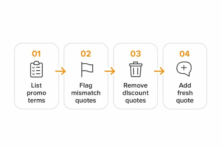
Promotion mismatch
Promotions change what people think they’re getting. Your testimonials must still fit the exact cart you’re pushing.
- List the current promo terms: SKUs, bundle contents, and any thresholds.
- Flag testimonials that reference a different bundle or discontinued variant.
- Remove or relocate quotes that mention specific discounts or “free” add-ons.
- Add one fresh quote that matches the promoted set and context.
- Re-read the wall as a shopper and check for “wait, is that included?” moments.
Punchline: Confusion about the deal feels like bait-and-switch, even when you’re being fair.
Placement and Routing
A testimonial wall can look impressive and still underperform if it’s poorly placed or leads nowhere. Put it where intent is high, then route shoppers back to a product decision fast.
Where it lives
Placement changes the job your wall needs to do. Choose the location that matches shopper intent and avoids extra clicks.
- Standalone page: SEO and browsing, higher friction
- PDP module: decision support, lowest friction
- Collection page: category reassurance, mid-funnel
- Cart/checkout: risk reduction, keep it minimal
- Post-purchase: UGC capture, not conversion
If your wall isn’t near a decision point, it becomes content—rather than proof.
Strong next steps
People believe proof faster when the next click is obvious. Add routes that point back to buying, not more browsing.
- Add a “Shop this product” CTA near the first screen.
- Link each quote to the referenced product or collection.
- Add filters like “See reviews for X” tied to real SKUs.
- Use a sticky CTA on scroll-heavy walls.
- Repeat a “Back to product” link after long sections.
The wall should behave like a ramp back to the PDP, not a museum tour.
Avoid proof detours
Detours happen when the wall offers too many exits and too few returns. Keep navigation tight and make “back to buying” impossible to miss.
A common failure is the “infinite proof loop.” Shoppers open a wall from a PDP, scroll, tap a random menu item, and never return. Remove unrelated header links on the wall, or minimize them on mobile. Keep a persistent path to the originating product, plus a clear CTA that matches the shopper’s likely next step.
If you can’t trace a clean path from proof to product in two clicks, fix routing first.
Turn Proof Into a Next Click
- Pick the outcome your testimonial wall must drive (PDP views, add-to-cart, checkout starts) and benchmark it.
- Map the most common entry paths and identify the first drop-off point after someone hits the page.
- Tighten trust signals for credibility and relevance: name the audience, product used, problem solved, and the objection addressed.
- Remove friction (unclear headline, dense layout, weak filtering) and add a single dominant next step that routes back to the right PDP or collection.
- Re-check message/offer consistency (pricing, promos, promises) so the proof supports what the shopper sees next.
Frequently Asked Questions
- Should a testimonial wall for ecommerce live on its own page or be embedded on product pages?
- Most ecommerce sites get better lift by embedding a curated set of testimonials on product and category pages, then using a full testimonial wall as supporting proof for shoppers who want to dig deeper. Treat the wall as a “confidence hub,” not the primary decision page.
- How many testimonials should I show on a testimonial wall for ecommerce without overwhelming shoppers?
- Start with a curated set (dozens, not hundreds) and add filters so people can quickly find reviews that match their use case (product, problem, size, skin type, etc.). If you have a large library, collapse long entries and prioritize the most specific, outcome-focused testimonials first.
- What should I collect from customers so testimonials actually persuade (not just praise)?
- Ask for concrete details: what they bought, the problem they were solving, what changed after using it, and any numbers or context they can honestly share (like fit, routine, timeframe, or before/after conditions). Always request permission to use their name/photo/company and clarify what can be published.
- How do I A/B test a testimonial wall for ecommerce without muddying the results?
- Test one variable at a time (headline, sorting, filters, CTA, or placement) and track downstream metrics like add-to-cart, checkout starts, and purchase—not just wall page engagement. Use your analytics tool (GA4, Shopify analytics, or your A/B platform) to define a single primary conversion event before you run the test.
- Is it better to use a dedicated tool for collecting and displaying testimonials instead of building a wall manually?
- A dedicated tool is usually better when you need a repeatable process for requesting, approving, and updating testimonials without developer time, and when you want consistent widgets across pages. Tools like ShowTrust can help you collect testimonials via a shareable form and publish curated displays more quickly than manual screenshots and page edits.
Turn Testimonials Into Conversions
Once you’ve triaged the wall, audited trust signals, and checked placement and routing, the next hurdle is executing those fixes without constant manual work.
ShowTrust makes it easy to collect, curate, and publish verified testimonials as on-site widgets or a public wall—so shoppers see credible proof fast and move to checkout.
Written by
ShowTrust
Notes from the ShowTrust team on collecting testimonials and building authentic social proof.
Share: