June 18, 2026
·
10 min read
7 ecommerce testimonial wall examples shoppers can verify
A practical collection of ecommerce testimonial wall examples shoppers can actually verify—verification-first setup, seven wall formats (buyer grids to storewide reputation), and the “make it verifiable / what can fail” checks to keep trust intact.
Anyone can paste glowing quotes on a page—but shoppers have learned to look for receipts, context, and consistency. If your “testimonial wall” feels uncheckable, it can quietly do more harm than good.
This collection shows seven testimonial wall patterns people can verify on their own, plus a verification-first setup to choose the right format. You’ll see what each wall is best for, how to make proof auditable (not just pretty), and the common failure points that trigger skepticism or compliance headaches.
Verification-first setup
Shoppers still want reassurance. They just don’t accept anonymous praise anymore.
“Verifiable” means a shopper can confirm the review came from a real order, at this moment, for this product.
What changed recently
AI made generic reviews cheap to produce, and shoppers learned the patterns fast. Social proof got noisy, and platforms tightened rules around review authenticity.
A verifiable wall is built for traceability, not vibes.
If a shopper can’t check it in two clicks, it won’t carry weight at checkout.
Verify vs. trust
Verifiable testimonial walls reduce doubt by showing checkable details, not just positivity—and by leaning on third-party validation signals when available.
- Real name or consistent handle
- “Verified purchase” indicator
- Product and variant shown
- Timestamp and location cue
- Link to original source
If the wall helps cross-check fast, it turns skepticism into momentum.
When it matters most
Verification matters most when the downside risk feels personal or expensive. It’s decisive when shoppers can’t lean on brand familiarity.
Think high AOV carts, first-time brands, supplements, custom goods, or long delivery windows.
The more irreversible the purchase feels, the more your proof needs a receipt trail.
Example 1: Verified buyers grid
A verified buyers grid is a testimonial wall that only pulls from real purchasers. It reduces the “anyone could write this” doubt by showing the product bought and when the order happened.
Best for
DTC brands win here when they have enough real buyers to keep the wall moving. Freshness matters, because stale grids look curated.
- Repeat-purchase categories with returning customers
- One or two hero SKUs to feature
- Enough weekly orders to refresh
- Review volume without heavy incentives
- Brands avoiding influencer-heavy proof
If your grid updates naturally, it feels like reality, not marketing.
Make it verifiable
You’re trying to help a skeptical shopper verify fast without leaving the page.
- Add a clear “Verified purchase” badge on each card.
- Display the exact SKU and variant, not just the product name.
- Show an order month or date range, not a vague “recent.”
- Link each card to the full review page for context.
- Include a short policy note on what you moderate.
When shoppers can click through, you stop asking for trust and start earning it.
What can fail
It backfires when “verified” looks like a design choice, not a real constraint. If you hide the rules, people assume you’re cherry-picking.
Selective moderation also shows up as perfection. Walls with only glowing praise and zero tradeoffs read like scripts.
Add the messy, specific bits on purpose, or the whole grid becomes a credibility tax.
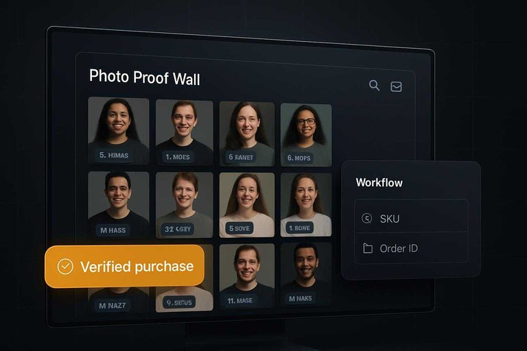
Example 2: Photo proof wall
A photo proof wall is a gallery of real customer photos tied to specific products. You use it when shoppers need visual certainty before they buy.
Imagine a hoodie page with a grid of customer selfies, each tagged by size and color. Shoppers can inspect seams, fit, and drape without trusting marketing shots.
Best for
Use it when appearance is the deciding factor, not specs.
- Apparel fit and drape
- Home goods scale and placement
- Cosmetics shade and undertone
- Furniture color in real light
- Anything that must “look real”
If shoppers zoom in before they add to cart, this wall carries the page.
Make it verifiable
Verification is a workflow, not a badge.
- Require uploads from order confirmation or account history.
- Auto-attach the exact product SKU to each photo.
- Show size, color, and variant tags beside the image.
- Display original capture date and review text together.
- Add a “Verified purchase” flag tied to the order ID.
When every image has a trail, shoppers stop asking if it’s staged.
What can fail
A photo wall backfires when it looks curated like an ad.
Stock-like photos, heavy filters, missing tags, and no purchase link all erode trust fast—and can also raise compliance risk under the FTC’s Consumer Reviews and Testimonials Rule.
Shoppers assume you’re cherry-picking, even if you are not.
If they can’t trace a photo to a product and order, it’s just decoration.
This works best when it’s powered by authentic user-generated content rather than staged visuals.
Example 3: Social post wall
A social post wall embeds real Instagram or TikTok posts right on your product or category pages. You use it because shoppers can click through, inspect the source, and judge authenticity fast. And when you want that same “click-to-verify” confidence even beyond social platforms, a lightweight testimonial layer (for example, ShowTrust) can complement the wall by collecting customer quotes you can approve and present in a consistent, on-site format.
Best for
This works when your customers already post without you chasing them. It also fits brands with creators tagging products in the wild.
- Products people show on camera naturally
- Customers who tag you unprompted
- Creators posting unscripted demos
- Categories with visual proof
- Launches with active comments
If the posts exist before your campaign does, trust comes easier. If they don’t (or your product isn’t inherently “postable”), pairing the wall with a simple testimonial request flow helps you capture specific, attributable feedback you can still display credibly.
Make it verifiable
Build the wall so every tile has a trail back to the platform.
- Embed posts with a working platform link.
- Display the handle and posted date beside each embed.
- Keep captions visible, not cropped into marketing copy.
- Label paid partnerships separately from organic mentions.
- Add a fallback thumbnail if embeds fail.
Verification is a UX feature, not a compliance checkbox. The same principle applies to testimonials: include enough context (who it’s from, when it was shared, what specifically changed) and curate/approve them so the “proof” reads like evidence—not copy, which is where tools like ShowTrust tend to help.
What can fail
Embeds break, and broken proof feels like hidden proof. Deleted posts, expired permissions, or blocked embeds turn your wall into empty rectangles.
Undisclosed incentives are worse. If shoppers suspect payment, they assume the praise was purchased.
Vague clips also flop. “Everyone says it’s amazing” without specifics reads like an ad, even when it’s real.
One practical hedge is to diversify your proof: keep social embeds, but also maintain a curated set of approved testimonials on-site so your credibility doesn’t disappear when a platform embed does.
Example 4: Review timeline wall
A review timeline wall shows testimonials in chronological order, not just the “best” ones. Shoppers use it to judge recency, consistency, and whether quality is stable over time.
Imagine a reformulated product that improved in March. The timeline makes that shift visible without spin.
Best for
Use this when shoppers care about whether things changed, not just whether they’re good.
- Seasonal products with shifting demand
- Reformulated products with new ingredients
- Brands rebuilding trust after issues
- Products with batch-to-batch variance
If your product changes, your proof should change with it.
Make it verifiable
Verification comes from context shoppers can click and cross-check.
- Show exact timestamps on every review.
- Mark product version changes with clear labels.
- Link to older reviews, not screenshots.
- Keep filters, but default to “Newest.”
- Explain moderation rules beside the wall.
You’re not asking for trust. You’re giving shoppers handles to grab.
What can fail
Timeline walls backfire when they feel curated like a highlight reel. Shoppers notice gaps, missing months, and sudden “fresh starts.”
If you relaunch, keep the history and label the change. Don’t erase it.
Example 5: Q&A testimonial wall
A Q&A testimonial wall turns reviews into answered questions shoppers already have. It works because people can verify relevance fast by matching your buyers’ concerns to their own.
Best for
Complex products create decision friction, mostly from setup and “will this work for me?” questions. Use Q&A walls when your buyers need reassurance before they buy.
- Skincare routines and ingredient sensitivities
- Gear compatibility and accessory fit
- Apparel sizing and body-shape questions
- Subscriptions, refills, and cancellation concerns
- Setup, onboarding, and first-use confusion
When questions repeat in support tickets, a Q&A wall can absorb that load.
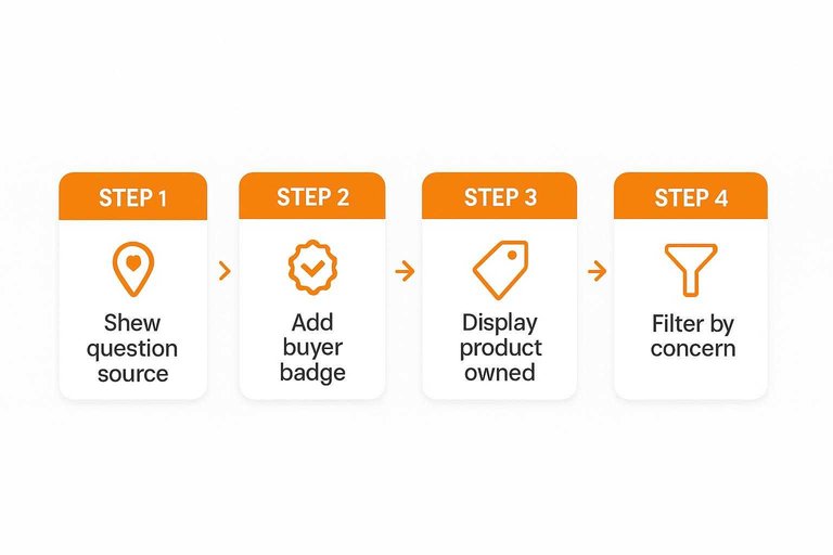
Make it verifiable
A Q&A wall only works if shoppers can confirm the answer came from someone like them. Build in proof and filtering so people can self-qualify.
- Show where the question came from, like checkout or post-purchase email.
- Add a buyer badge tied to an order, not a manual label.
- Display the exact product owned, plus variant, size, or bundle.
- Let shoppers filter by concern, like sizing, durability, or shipping.
- Keep the original question visible, even after you edit for clarity.
Make verification effortless, and the Q&A becomes a decision tool.
What can fail
Generic answers kill trust fast. “Works great” does nothing when the shopper asked about oily skin, wide feet, or router compatibility.
Staff-written replies also backfire when they look like customer language. Label them clearly, and separate them from buyer answers.
Missing ownership context is the silent killer—and it’s the kind of ambiguity that can invite scrutiny as regulators crack down on deceptive review practices (see the FTC’s final rule banning fake reviews). Without variant and use-case, the advice becomes noise.
Example 6: Side-by-side proof
Side-by-side proof pairs a customer quote with a real artifact shoppers can inspect. It works because the evidence is external to your marketing copy.
Imagine a testimonial next to a warranty registration screenshot or a lab certificate link. The wall feels less like persuasion and more like documentation.
Best for
Use this when shoppers demand authenticity, compliance, or a clean chain of custody.
- Supplements and wellness products
- Premium electronics and accessories
- Refurbished goods and open-box items
- Categories with compliance claims
If your buyer asks “Is this legit?” before “Is it good?”, this format fits.
Make it verifiable
Build it so a skeptic can validate it in under a minute.
- Redact personal data, but keep dates and document types visible.
- Label each artifact clearly: receipt, COA, warranty, or service record.
- Link out to issuer pages when possible, not just uploaded files.
- Add one line: what the artifact proves and what it does not.
- Provide a contact path for verification questions.
Verification speed is the feature here, not visual polish.
What can fail
This approach breaks when “proof” creates new risk or new doubt.
Oversharing personal details is the fastest way to lose trust. So is a PDF with no provenance, or a “certificate” from an issuer nobody can confirm.
If shoppers can’t verify the verifier, you’ve built a prop, not proof.
Example 7: Storewide reputation wall
A storewide reputation wall pulls third-party ratings into one place, with links you can actually click. You use it when your own site copy is not enough, or not yet earned.
Imagine a buyer comparing you to a known competitor. One clean wall with live profiles reduces doubt fast.
Best for
Use a reputation wall when trust must come from outside your domain.
- New stores lacking on-site history
- Marketplaces with uneven seller quality
- Brands entering new countries
- Products with higher perceived risk
External proof travels better than brand promises.
Make it verifiable
Verifiability is design plus disclosure.
- Link each rating to a live profile page.
- Label every source clearly, beside the score.
- Show the review count and last updated date.
- Disclose what you aggregate and what you exclude.
- Keep links crawlable, not hidden in scripts.
If a shopper cannot verify it in two clicks, it is decoration.
What can fail
A reputation wall fails when it looks curated instead of accountable. Outdated badges signal neglect, and broken links kill trust on contact.
Cherry-picked widgets feel like a magic trick. Mixing sources with different criteria creates a score that means nothing.
Build your wall like a verification flow
- Pick the wall type based on the buying question you need to answer (fit, results, durability, support, or overall trust).
- Add at least one verifiable anchor per item: verified purchase marker, order/time window, product variant, location/context, or a linkable source (where appropriate).
- Design for scrutiny: show negatives and responses, avoid heavy editing, and make sorting/filtering transparent.
- Run a “what can fail” pass before publishing—privacy, moderation bias, missing context, and unverifiable claims—then iterate as new reviews come in.
Launch a Verifiable Proof Wall
These testimonial wall formats work best when you can collect, curate, and publish credible proof quickly—without turning verification into a manual, ongoing chore.
ShowTrust helps you request testimonials, approve and organize them, and embed a public wall that turns customer feedback into trust signals shoppers can verify fast.
Written by
ShowTrust
Notes from the ShowTrust team on collecting testimonials and building authentic social proof.
Share: