June 15, 2026
·
10 min read
5 Real Examples of Embedded Testimonials That Build Trust
A case-study style guide to using embedded testimonials that build trust at the exact decision point — understand what “embedded” really means, why it changes behavior, when it backfires, and how it works across pricing pages, checkout flows, product tours, blog content, and in-app moments.
Testimonials aren’t the problem—where you put them is. If social proof lives on a lonely “Reviews” page, it shows up after your visitor has already hesitated, doubted, or bounced.
This case study breaks down five real placement patterns where testimonials are embedded inside the journey: pricing, checkout, product tours, blog posts, and in-app moments. You’ll see what changed, what actually helped (and what didn’t), plus the lesson you can apply to your own pages without turning them into a wall of quotes.
Trust Before Proof
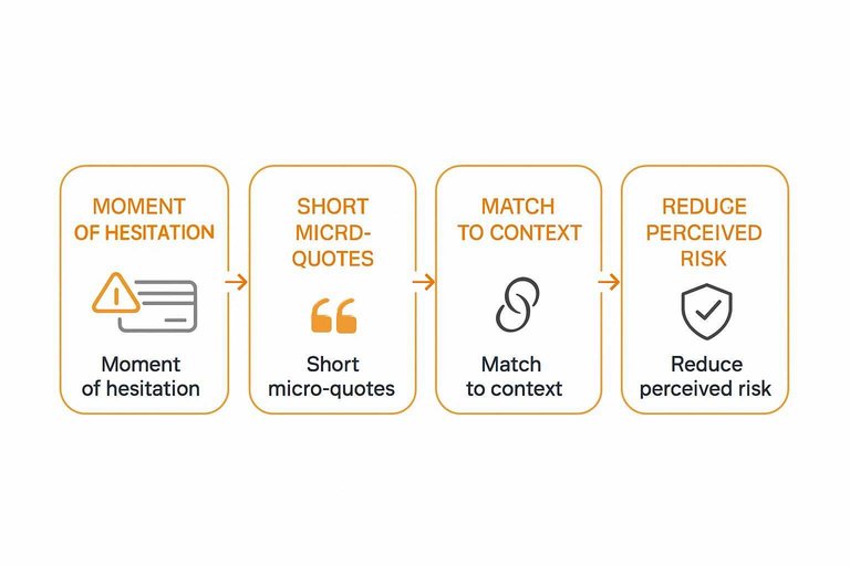
Standalone testimonial pages are easy to ignore because they sit outside the decision path. Embedded testimonials work because they show up where doubt shows up, inside your product, content, or funnel.
You’ll see five placements you can copy, plus simple criteria to judge if each one belongs. The goal is not “more quotes.” It’s fewer objections at the exact moment they appear.
What “embedded” means
Embedded testimonials are credibility cues placed inside the experience people are already using. They live next to a claim, a feature, a price, or an action.
Think of a short customer line under a pricing tier, or beside a form field that triggers anxiety. That placement is the whole point.
Why it changes behavior
People don’t doubt your product in the abstract. They doubt it at decision moments, like “Will this work for me?” or “Is this worth it?”
A testimonial embedded at that moment answers the objection while it’s active. It feels like confirmation, not a detour.
When it backfires
Embedded testimonials can hurt trust when they feel like decoration instead of evidence.
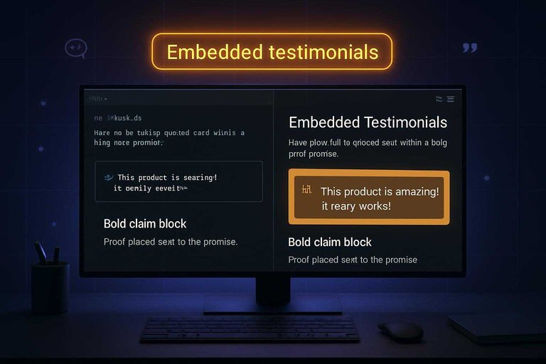
Example 1: Pricing Page
A pricing page is where intent is highest and anxiety spikes. Put proof right where the questions appear, not three clicks later.
Placement pattern
Place a short quote beside each plan to answer the tier-specific worry in one glance. Then add a longer proof block near the primary CTA to reduce last-second hesitation.
Example layout: one-line quote under each price, plus a 3–5 line customer block next to “Start trial.”
When proof sits beside price, you stop forcing users to mentally bridge the gap—and you can keep key reassurance above-the-fold trust elements where it gets seen first.
What changed
The page stopped trying to “win” on features alone. Each plan started selling reassurance about the outcome for its ideal buyer.
A starter tier quote calmed value doubts, while a pro tier quote reduced fit and workflow risk.
Features explain capability. Testimonials explain confidence.
What worked
Tactics that make pricing-page testimonials pull their weight:
- Use plan-specific quotes, not generic praise
- Map snippets to common objections per tier
- Include recognizable roles, not vague titles
- Keep formatting scannable: bold phrase, short line
If your quote can’t be skimmed in two seconds, it won’t be read at checkout speed.
What didn’t
Common ways pricing testimonials fail:
- Reuse the same quote on every tier
- Paste long blocks that bury the point
- Use anonymous names or “Verified user” only
- Write claims that sound like ad copy
If it reads like your marketing team wrote it, your buyers will treat it like noise.
Lesson learned
Match each testimonial to the plan’s main risk, not the plan’s feature list. Value fears need ROI language, fit fears need use-case specifics, switching cost fears need migration reassurance, and support fears need responsiveness proof.
Treat testimonials like risk reducers, tier by tier.
The best pricing pages don’t argue. They de-risk.
Example 2: Checkout Flow
Checkout is where confidence collapses. Payment fields trigger fraud fears, refund doubts, and shipping uncertainty.
Embedded testimonials work here when they answer those doubts in place, fast. No detours.
Placement pattern
Checkout testimonials should sit beside the moment of hesitation. You’re not decorating the page. You’re calming a specific fear.
Place short micro-quotes:
- Near card fields and “Pay” button
- Beside guarantee and refund text
- Next to shipping dates or delivery estimates
- Beside renewal, trial, or billing cadence details
If the quote isn’t visible at the decision point, it’s dead weight.
What changed
Generic praise creates a new question: “But will this work for me?” Checkout needs the opposite. Clarity. Certainty.
Swap broad testimonials for reassurance like:
- “Refund was easy.”
- “No surprise charges.”
- “Arrived when promised.”
- “Onboarding took minutes.”
You’re not raising excitement here. You’re removing friction.
What worked
The best checkout proof feels like a friend answering your exact concern. Short. Specific. Close to the scary part.
- Use “peace of mind” quotes about billing and refunds
- Pair trust badges in checkout with one human micro-quote
- Put tight reassurance copy beside policy links
- Match quotes to shipping, renewal, or trial context
Make the quote do one job. Reduce perceived risk.
What didn’t
Checkout is a narrow tunnel. Anything that widens attention increases drop-off risk.
- Triggering popups during payment entry
- Rotating carousels that pull focus
- Testimonials about results, not checkout concerns
- Long quotes that require scrolling
If users start reading like they’re researching again, you broke the flow.
Lesson learned
Checkout testimonials should lower the mental cost of saying yes. They should confirm safety and predictability.
Add proof that resolves risk. Don’t add claims they need to verify—especially in the payment step where perceived security of payment forms can make or break completion.
Example 3: Product Tour
An interactive product tour is where users decide if your product feels easy or exhausting. Embedded testimonials work best when they remove doubt at the exact moment it appears—and tools like ShowTrust make it easier to collect, curate, and place those quotes exactly where they support the flow.
Placement pattern
Place testimonials right after the tour’s “aha” steps, when a feature clicks in the user’s head. Add another quote at the friction points, where users worry about setup effort or hidden complexity.
For example, after the tour shows a first successful result, a short quote can validate the payoff. Then, near an integration or configuration step, a second quote can calm the “this looks hard” reaction.
Your tour already creates momentum. Use testimonials to protect it. If you’re managing proof in a system like ShowTrust, it’s simpler to keep a small set of approved, role-relevant quotes on hand so you’re not scrambling for the right line mid-tour.
What changed
The tour stopped trying to persuade with more feature explanation. It shifted to peer validation for the three questions users always ask: “How long will this take?”, “Will I learn it quickly?”, and “Will my team actually use it?”
Instead of adding another tooltip about settings, the tour surfaced a concise quote about getting started smoothly. Instead of claiming collaboration is “simple,” it used a teammate-focused line about adoption.
When the doubt is social, the answer should be social. This is also where basic curation matters—having a place to approve and organize testimonials (so only the clearest, most credible snippets show up) keeps the tour from feeling improvised.
What worked
Tactics that kept trust high without slowing the tour:
What worked
- Match quotes to the viewer’s role
- Tie snippets to a specific scenario
- Keep quotes to one idea
- Link full stories only when asked
What worked
Generic proof gets ignored. Specific proof gets believed.
What didn’t
Stuffing the tour with social proof backfires fast. Every extra quote adds reading, decisions, and context switching.
Users stop following the flow and start scanning for the “next” button. Completion drops because the tour feels like a pitch, not guidance.
Proof is helpful. Too much proof is noise. A practical safeguard is limiting yourself to a small, curated set of testimonials—whether you manage them in ShowTrust or elsewhere—so you don’t keep adding “just one more” quote.
Lesson learned
Testimonials should confirm progress, not compete with the next action. The tour’s job is movement, and the testimonial’s job is reassurance.
If a quote makes the user pause, shorten it or move it later. Keep the click path sacred.
Trust works best when it’s a tailwind, not a detour. The easiest way to maintain that is treating testimonials as a managed library—approved, organized, and ready to embed only at the moments they reduce doubt.
Example 4: Blog Content
A blog post is where skepticism shows up fastest. You make a claim, readers think “sure,” and bounce.
Embedded testimonials fix that by placing proof at the exact moment doubt appears. Done well, it feels like evidence, not marketing.
Placement pattern
You don’t tuck testimonials at the bottom like a footer badge. You place them beside the claim they support, while the reader is still deciding.
For example, put a short quote next to a framework step, a key takeaway box, or a common objection callout. Keep it tight, and link it to the specific point on the page.
When proof sits next to the promise, “sounds too good” loses its grip.
What changed
The post stopped leaning on founder stories as the main evidence. Instead, it used reader-relevant proof that matched the post’s exact promise.
Imagine a post promising “a simple onboarding checklist.” The embedded quote shouldn’t say “love the product.” It should say the checklist reduced confusion, aligned a team, or clarified next steps.
Relevance beats enthusiasm every time.
What worked
These techniques keep testimonials credible without breaking flow.
What didn’t
These patterns quietly weaken trust, even when the praise is positive.
Poorly implemented pull quotes can also create accessibility issues—like duplicated text being read twice by screen readers—so it’s worth avoiding repeated-text pull quote patterns that distract from the instructional flow.
Lesson learned
Your blog isn’t a landing page in disguise. The job is to teach, then prove.
Embedded proof should make the instruction easier to believe, not harder to read. If it feels like an ad, you’ve crossed the line.
Keep the proof subordinate to the lesson, and the trust compounds.
Example 5: In-App Moments
In-app testimonials work because they meet users where doubt actually shows up. Activation and renewal are the two moments where confidence slips, and churn risk spikes.
Imagine a user finishing setup, then hesitating at “Invite teammates” or “Connect billing.” A small, relevant quote can steady the decision without derailing the flow.
Placement pattern
The goal is to place proof where friction is normal, not where dopamine is high. You’re reinforcing “this is worth it” during micro-decisions inside the product.
Good in-app placements:
- Onboarding milestones after a hard step
- Empty states before first success
- Feature unlocks at first access
- Upgrade prompts near value moments
If users see it right before they decide, it behaves like guidance, not marketing.
What changed
Celebration screens feel good, but they don’t answer the quiet question: “Did I do it right?” Swapping confetti for reassurance reduces second-guessing.
Instead of “Nice work!” you show “Teams like yours succeeded after this step.”
Reassurance beats hype when users are trying to avoid a mistake.
What worked
These plays keep proof relevant and lightweight, without turning your UI into a billboard.
- Segment-based quotes by role or plan
- Short video clips under ten seconds
- One-sentence quotes with a name and title
- “See the full story” after completion
- Case story links inside success toasts
Make the next click optional, and you’ll earn the right to ask again later.
What didn’t
Bad timing makes testimonials feel like pressure, not help. Users notice when proof shows up to override their frustration.
A quote during an error state, outage banner, or forced upgrade wall reads as manipulation. It also backfires because the product is failing in that exact moment.
Fix the experience first, then earn trust with proof.
Lesson learned
In-app proof should follow intent, not fight it. Users came to complete a job, and your UI needs to protect that focus.
Help them succeed first, sell second. That’s the line that gets crossed.
Embed Proof Where Doubt Happens
- Pick one high-friction step (pricing, checkout, tour, content, or in-app) and identify the exact question users hesitate on.
- Embed one specific testimonial right next to that decision, written in the customer’s words and tied to the objection.
- Keep it scannable and credible (context, role/company when appropriate), then remove anything that feels generic or salesy.
- Validate with behavior signals and qualitative feedback, and iterate placement and wording before you add more quotes.
Turn Feedback Into Trust Signals
Embedding testimonials in the right moments is powerful, but collecting, curating, and keeping them fresh across pages takes consistent execution.
ShowTrust makes it easy to request testimonials, approve the best ones, and embed verified social proof across your site to lift trust and conversions.
Written by
ShowTrust
Notes from the ShowTrust team on collecting testimonials and building authentic social proof.
Share: